Divi Image Module
The Supreme Image allows you to transform the image using 3D transformation. Rotate it like the way you always wanted without coding.
Content Options
Image
Place a valid image url here, or choose/upload an image via the WordPress Media Library. Images will always appeared left justified within their columns and will span the full width of your column. However, your image will never scale larger than its original upload size. The height of the image is determined by aspect ratio of your original image.
Link
Open in Lightbox
Here you can choose whether or not your image will open in a Lightbox when clicked. If enabled, then your image will “zoom in” to their full size when clicked inside a modal window. This is a great feature for portfolios.
Link URL
Place a valid web URL in this field to turn your Image into a link. Leaving this field blank will simply leave your image as a static element.
Use as Video Popup
Enable this option if you want to show a video in overlay when user clicks on the Image. You'll then prompted to enter the URL of the Video you want to show in the overlay
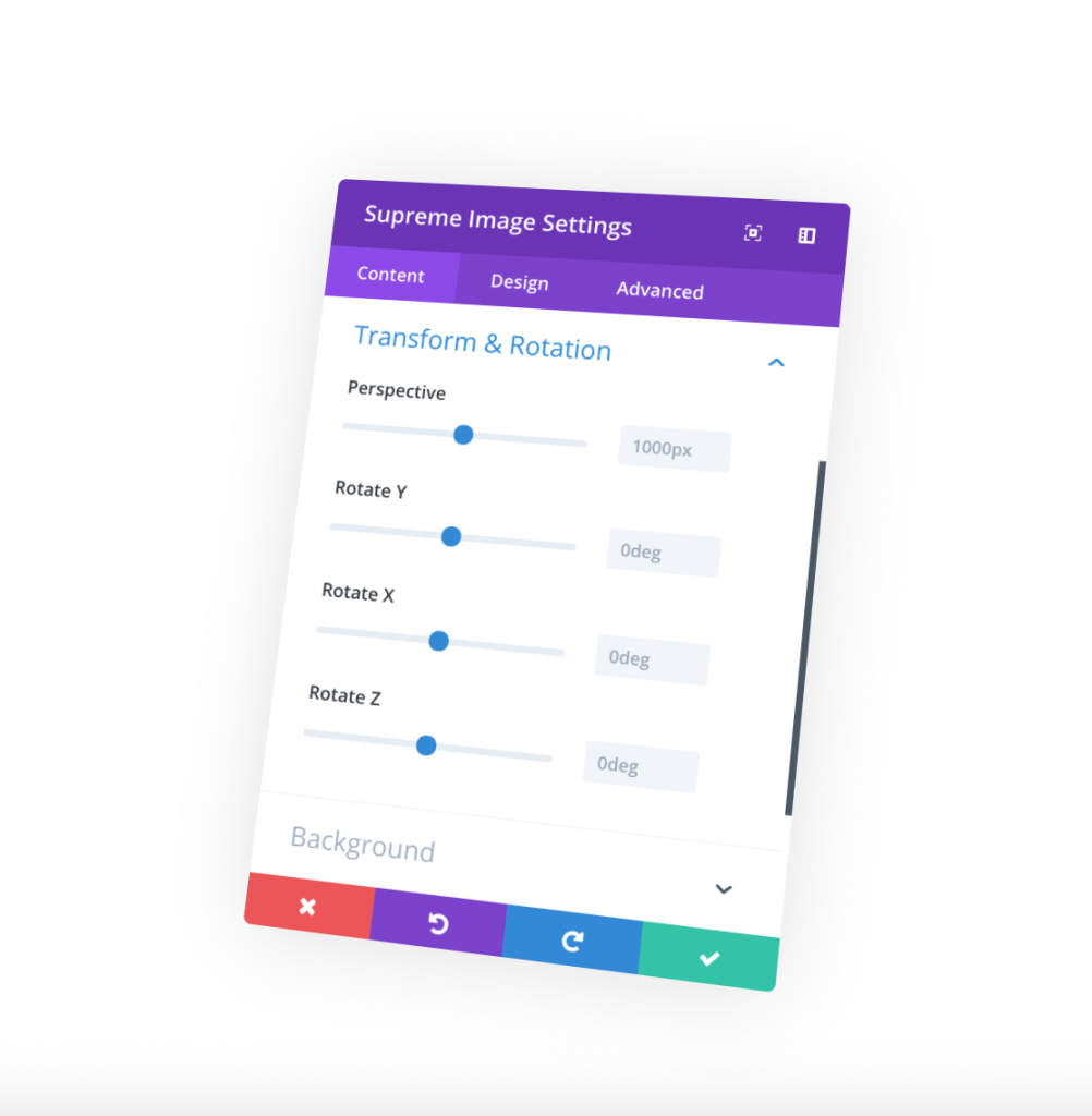
Transform & Rotation
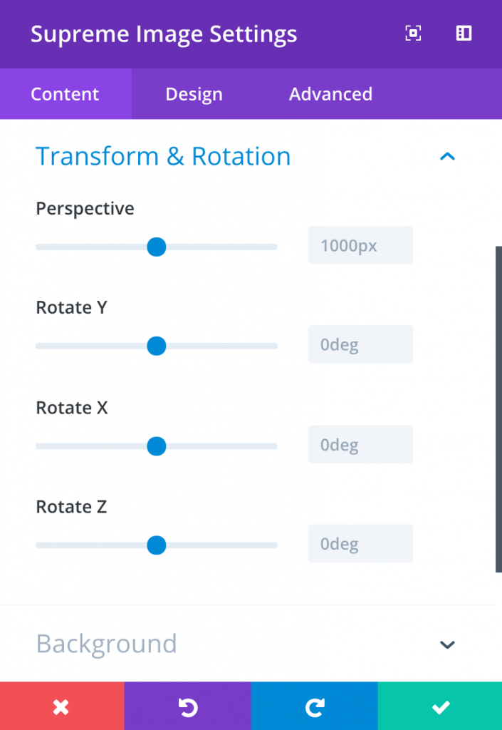
Perspective
The perspective CSS property gives an element a 3D-space. The strength of the effect is determined by the value.
Rotate Y
Defines a transformation that rotates an element around the ordinate (vertical axis) without deforming it.
Rotate X
Defines a transformation that rotates an element around the abscissa (horizontal axis) without deforming it.
Rotate Z
Defines a transformation that rotates an element around the z-axis without deforming it.
Admin Label
This will change the label of the module in the builder for easy identification. When using WireFrame view in the Visual Builder, these labels will appear within the module block in the Divi Builder interface.
Design Options
Within the design tab you will find all of the module’s styling options, such as fonts, colors, sizing and spacing. This is the tab you will use to change how your module looks. Every Divi module has a long list of design settings that you can use to change just about anything.
Overlay
Image Overlay
If enabled, an overlay color and icon will be displayed when a visitors hovers over the image.
Overlay Color
Here define a color for the Overlay.
Use Icon
Enable this option if you also want to show an icon in the overlay of image when hover.
Overlay Icon Color
Here you can define a custom color for the overlay icon
Icon Picker
Select an Icon from Divi Icon library here.
Show overlay on Hover
Enabling this option will only show the Overlay when hover to image. You can disbale this option if you want to always show the Overlay.
Overlay Rounded Corners and Border
You can then add Corner Radius and Border to the overlay if you like
Alignment
Image Alignment
Here you choose which direction your image floats within the column. You can float the image left, right or keep it centered.
Always Center Image On Mobile
Often times small images are more pleasing to the eye on mobile devices when they are centered. As columns break down, images that were aligned the left or right in smaller columns become orphaned when the columns break down and become 100% width. Enabling this column with force images to align to the center of the column on mobile without affecting the image alignment on desktop computers.
Advanced Options
Use the advanced options to give your text module custom CSS ID’s and Classes. Add some custom CSS for advanced styling and designate the module’s visiblity on certain devices.