Divi Card Module
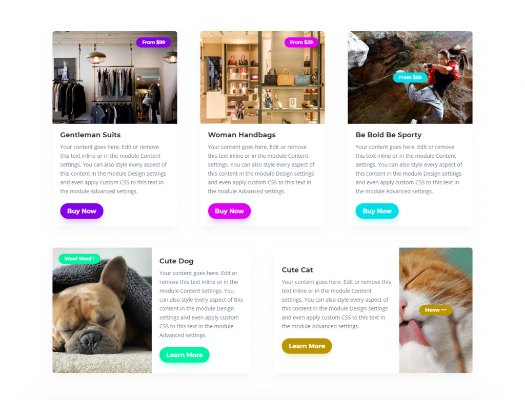
A creative Divi module to display a beautiful combination of texts, links, badge and image. With Image Hover Zoom animation, you can now impress your visitors even more.
Content Options
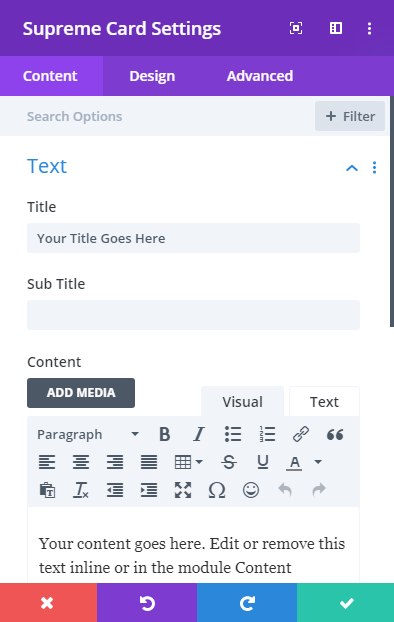
Text
Title
Enter your title text here. You can take out the text if you don’t want the Title text.
Subtitle
Enter your subtitle text here. You can take out the text if you don’t want the subtitle text.
Content
Enter your description text here. You can take out the text if you don’t want the description text.
Image & Badge
Manage your Image and Badge text here.
Image
Add an image from your Library here.
Use Image as background
Enable this option to use the image as the background so you can play around with the position and Height of the image and even add hover animation to the image.
Image Height
Change the height of the image by sliding the slider.
Background Image animation
Add animation to the image from 4 different animations and to even add more in upcoming updates.
Animation Speed (in ms)
Change the Hover Background Image Speed from here in ms.
Badge Text
Add text to the Badge here. You can take out the text if you don't want the badge text. You can also add a link to the badge under the link panel.
Icon
If you want to add an Icon to the Card you can do so here.
Use Icon
Enable this switch to enable the Use of Icon for the Card Module. Once you'll enable this you'll see so many Icons to choose from.
Button
Button text
Add text to the button here you can always remove the text of the element which you don’t want.
Button URL
Add a URL to the button here.
Design Options
Layout & Alignment
Layout
Change the type of layout to Stacked or Inline.
- Stacked will place the image on top and content on the bottom.
- Inline will place the content Inline which means Image and content both in the same line.
- Layout type Inline Settings - If you’ll select this layout type you will be able to see these options:
- Width: Change the width of the image 2.** Order Alignment**: Change the alignment of the image to Left(Places the image on the left side of the content) or Right (Places the image on the right side of the content).
- Horizontal Content Alignment - This option will let you align the content to Top, Center or Bottom, most helpful while using the inline layout type.
Use Equal Height
Enable this option to make all the Cards match the heights, make sure to enable "Equalize Column Heights" in Row settings as well. See at the very for more details.
Image Height
You can control the height of the Image Wrapper here (not the actual image). For this option to work, make sure "Use Image as Background" is disabled in Content Tab -> Image & Badge.
Image Vertical Alignment
Here you can control vertical alignment of the Image, Top, Bottom and Center.
Image
Make changes to the image here.
Image Width
You can change the Image Width here.
Image Alignment
You can change the Image Alignment here to Left, Right or Center.
Stretch Image
Enabling this option will stretch the img tag and set a maximum width for the image. This allows for more control over the image’s display, ensuring it fits well within the module’s layout while maintaining its aspect ratio.
Image Overlay
Enable this switch if you want to add overlay color or icon or both to the image.
Overlay Color
Change the color of the overlay on the image to your own one.
Use Icon
You can enable this option if you want to show an icon in the overlay. And then can choose any icon from the Divi Icon Library and Change it’s color as well.
Image Rounded Corners, Border and Box Shadow
Here you can control the corner radius of the Image. Enable the link icon to control all four corners at once, or disable to define custom values for each. you can play around with adding borders and Box Shadow to the Image.
Badge
Change badge’s position color, background color and more here.
Position
Change the position of the badge anywhere on the Image.
Use Custom Position
Enabling this switch will let you position the badge on your own custom position on the image.
Background Color
Change the background color of the badge to your desired one.
Padding
Add padding to the badge here to expand it more.
And you can play with the badge text by changing its font, size, color and weight and even add shadow to the badge text.
Add Rounded Corners, Border and Box Shadow to Badge
Here you can control the corner radius of the Image. Enable the link icon to control all four corners at once, or disable to define custom values for each. you can play around with adding borders and Box Shadow to the Image.
Other Titles, Subtitle, and Body Texts
And you can always play with the Title, Subtitle and Body text by changing its font, size, color and weight and even add shadow to the text by going to their design panels.
Button
Enable Use Custom Styles for button to add custom stylings to the button. You can design the button same way you always design your Divi Buttons you can change button, font, size, weight and more and play with Margin and Padding and also you can add Corner Radius, Border and Box Shadow to the button.
Advanced Options
Use the advanced options to give your Card module custom CSS ID’s and Classes. Add some custom CSS for advanced styling and designate the module’s visibility on certain devices.
How to Equalize Card Heights
If you want to equalize card heights to the other cards in the Row, you can easily do that by going to Row settings -> Design tab -> Sizing -> and enable "Equalize Column Heights". This will equalize the Card Heights in that row.
How to Equalize Card Heights
In some cases, you'd like to have multiple cards in a row to be equal of height no matter the length of content, we've made that easy for you.
You'll need:
- Enable "Equalize Column Heights" Options in Row settings.
- Enable "Use Equal Height" in Card Module for each Card.
Here's a video for better understanding:
How to align buttons to the bottom
In many cases, when you've equal height cards, you'll want that buttons should be at the bottom. For that, you need to make sure that the "Equalize Column Heights" Option is enabled in the Row settings and then add the below CSS anywhere, For Example, Divi -> Theme Options -> Custom CSS box or in Page settings -> Custom CSS.
.dsm_card_wrapper .et_pb_button_wrapper {
margin-top: auto;
}