Divi Card Carousel Module
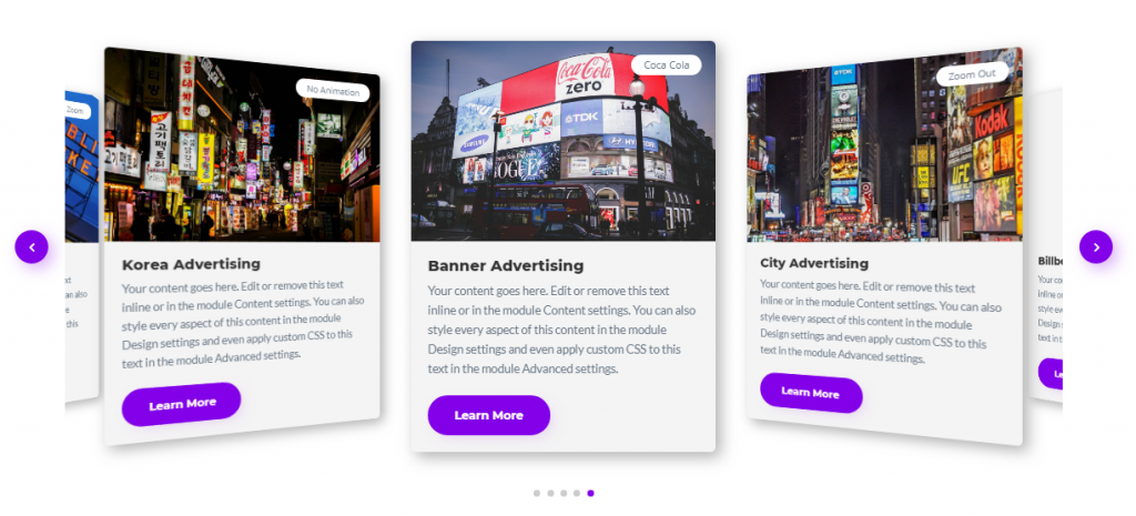
A creative and fully customizable Divi Carousel module to display a beautiful combination of texts, links, badge and image in a Carousel Slider. Control and customize almost everything in this powerful carousel module. It comes with image and video lightbox/popup for Image and Button and many more Carousel Settings. You can design an unlimited number of carousels with this module.
Content Options
Adding Carousel Items
Click on + Add new Item to add your first Carousel. Clicking + Add new Item will open a completely new list of design settings (including Content, Design, Advanced) for your new Carousel.
See below for individual Carousel Item settings.
After you add your first Carousel, you will see a gray bar appear with the title of your Carousel shown as a label. The gray bar also has three buttons that allow you to edit, duplicate, or delete the Carousel.
Carousel Settings
Carousel Effect
Choose a Carousel effect from 4 Different Effects and more to add soon.
- Slide
- Coverflow
- Flip
- Cube
Coverflow Effect settings
If you'll select Carousel Effect as Coverflow you'll see these options:
- **Show Shadow **- Adds a shadow to next Carousel Images.
- Coverflow rotate - Set the Rotate amount of the next images in the slide.
- **Coverflow Depth **- Increase to show more items in the carousel with coverflow effect.
Carousel Direction
You can change the Carousel Content Direction from here, It can be either "Left to Right" or "Right to Left".
Centered Mode
If enabled, then the active slide will be centered, not always on the left side.
Slides to Show
Change the number of slides you want to show in the carousel. You can enable the responsive option to adjust it for different screen sizes.
Slides to Scroll
Change the number of slides you want to scroll when click on the arrow key to see the next slides.
Slides Speed
Adjust the speed of the slider when changing the slides.
Autoplay
You can enable this option to slide Carousel Items automatically.
Autoplay Change interval
Change the time interval for the slides to change after that time.
Pause on Hover
Enable this option if you want to stop the Autoplay when Hover over to Carousel.
Spacing
Add some spacing between carousel Items.
Infinite Looping
Enabling this option causes the carousel to loop. Means when you’ll click on the arrow to go to next slide it will then keep looping and shows all the item from first to end. Disabling this will show only the number of images and you can’t use the next arrow if slides are ended then you’ll have to use the previous arrow.
Equalize Card Heights
Equalize the carousel Items height. Carousel Card Items will be 100% in Height.
Show Arrow
Enable or Disable this option to show or hide the arrows.
Show Pagination
Enable or Disable this option to show or hide the pagination dots.
Disable Touch/Dragging
Use this option to disable touch/drag to slide the Carousel.
Use Grab Cursor
Enable or Disable this option to change the mouse icon to grab cursor icon.
Design Options
Layout & Alignment
Layout
Change the type of layout to Stacked or Inline.
- Stacked will place the image on top and content on the bottom.
- Inline will place the content Inline which means Image and content both in the same line.
Layout type Inline Settings
If you’ll select your layout type you will be able to see these options:
- Width: Change the width of the image
- Order Alignment: Change the alignment of the image to Left(Places the image on the left side of the content) or Right (Places the image on the right side of the content).
- Horizontal Content Alignment - This option will let you align the content to Top, Center or Bottom, most helpful while using the inline layout type.
Image
Make changes to the image here.
Image Width
You can change the Image Width here.
Stretch Image
Enabling this option will stretch the img tag and set a maximum width for the image. This allows for more control over the image’s display, ensuring it fits well within the module’s layout while maintaining its aspect ratio.
Image Alignment
You can change the Image Alignment here to Left, Right or Center.
And you can make design changes to the image here. Here you can control the corner radius of the Image. Enable the link icon to control all four corners at once, or disable to define custom values for each. you can play around with adding borders and Box Shadow to the Image.
Badge
Change badge’s position color, background color and more here.
Position
Change the position of the badge anywhere on the Image.
Background Color
Change the background color of the badge to your desired one.
Padding
Add padding to the badge here to expand it more.
And you can play with the badge text by changing its font, size, color and weight and even add shadow to the badge text.
Add Rounded Corners, Border and Box Shadow to Badge
Here you can control the corner radius of the Image. Enable the link icon to control all four corners at once, or disable to define custom values for each. you can play around with adding borders and Box Shadow to the Image.
Arrow Element
This is the place where you can add custom styles to the arrow icons.
Arrow Position
Change the position of the arrow inside or outside of the carousel.
Mobile Arrow Position
Change the position of the arrow inside or outside of the carousel for Mobile only.
Use Arrow Custom position
Enable this option if you want to add both arrow icons to your custom position.
Use Custom Previous Arrow Icon
Enabling this option will let you use a custom icon for the Previous Arrow. You can browse many Icons from Divi Icon Library.
Use Custom Next Arrow Icon
Enabling this option will let you use a custom icon for the Next Arrow. You can browse many Icons from Divi Icon Library.
Arrow Size
Change the font size of the arrow.
Arrow Color
Change the color of the arrow.
Arrow Background Color
Change the background color of the arrow.
Arrow Rounded Corners
Add Rounded corners to the Arrow Icons.
Arrow Border and Box Shadow
Add Border and Shadow to the arrow Icons.
Pagination Element
Pagination Horizontal Placement
Change the horizontal position of the pagination dots.
Pagination Active Color
Change the color of the current pagination dot.
Pagination In-Active Color
Change the color of all the other pagination dots.
Other Titles, Subtitle, and Body Texts
And you can always play with the Title, Subtitle and Body text by changing its font, size, color and weight and even add shadow to the text by going to their design panels.
Button
Enable Use Custom Styles for the button to add custom stylings to the button. You can design the button same way you always design your Divi Buttons you can change button, font, size, weight and more and play with Margin and Padding and also you can add Corner Radius, Border and Box Shadow to the button.
Align Button Vertically
Enable this option, If you'd like to vertically align the button. This option will be shown If you've enabled the "Equal Height" option in the Carousel Settings Panel. You can align the button to Top, Center or Bottom from here.
Border
Card Corner Radius - Add Rounded corners to the single card item.
**Card Border ** Add Border - Change its color and width for the single card item.
Box Shadow
Add Shadow to the Single Card Item to make it look more natural.
Advanced Options
Use the advanced options to give your Card Carousel module custom CSS ID’s and Classes. Add some custom CSS for advanced styling and designate the module’s visibility on certain devices.
Carousel Item Content Options
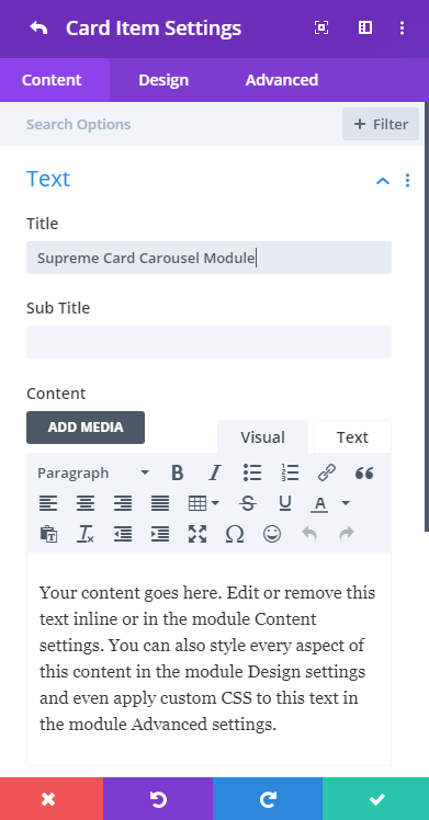
Text
Title
Enter your title text here. You can take out the text if you don’t want the Title text.
Subtitle
Enter your subtitle text here. You can take out the text if you don’t want the subtitle text.
Content
Enter your description text here. You can take out the text if you don’t want the description text.
Image & Badge
Manage your Image and Badge text here.
Image
Add an image from your Library here.
Use Image as background
Enable this option to use the image as the background so you can play around with the position and Height of the image and even add hover animation to the image.
Image Height
Change the height of the image by sliding the slider.
Background Image animation
Add animation to the image from 4 different animations and to even add more in upcoming updates.
Animation Speed (in ms)
Change the Hover Background Image Speed from here in ms.
Open as Image Lightbox
Enable this option if you want to open the image in the lightbox when clicked. When you’ll enable this option you’ll then add an image from your library which will be opened in Lightbox.
Open as VideoLightbox
Enable this option if you want to show a video in an overlay. When you’ll enable this option you’ll then asked to put the URL of the video in field and module will do the rest.
Badge Text
Add text to the Badge here. You can take out the text if you don’t want the badge text. You can also add a link to the badge under the link panel.
Button
Button text
Add text to the button here you can always remove the text of the element which you don’t want.
Button URL
Add a URL to the button here.
Open as Image Lightbox
Enable this option if you want to open an image in the lightbox. When you’ll enable this option you’ll then add an image from your library which will be opened in Lightbox. And when you’ll click the button an image will be shown in Lightbox.
Open as Video Lightbox
Enable this option if you want to show a video in an overlay. Make sure you’ve added the video link to the Button URL field. And when you’ll click the button the video will be shown in Lightbox.
Item Design Options
Image
Image Overlay
Enable this switch if you want to add overlay color or icon or both to the image.
Overlay Color
Change the color of the overlay on the image to your own one.
Use Icon
You can enable this option if you want to show an icon in the overlay. And then can choose any icon from the Divi Icon Library and Change it’s color as well.
Image Rounded Corners, Border and Box Shadow
Here you can control the corner radius of the Image. Enable the link icon to control all four corners at once, or disable to define custom values for each. you can play around with adding borders and Box Shadow to the Image.
Badge
Change badge’s position color, background color and more here.
Position
Change the position of the badge anywhere on the Image.
Use Custom Position
Enabling this switch will let you position the badge on your own custom position on the image.
Background Color
Change the background color of the badge to your desired one.
Padding
Add padding to the badge here to expand it more.
And you can play with the badge text by changing its font, size, color and weight and even add shadow to the badge text.
Add Rounded Corners, Border and Box Shadow to Badge
Here you can control the corner radius of the Image. Enable the link icon to control all four corners at once, or disable to define custom values for each. you can play around with adding borders and Box Shadow to the Image.
Other Titles, Subtitle, and Body Texts
And you can always play with the Title, Subtitle and Body text by changing its font, size, color and weight and even add shadow to the text by going to their design panels.
Button
Enable Use Custom Styles for the button to add custom stylings to the button. You can design the button same way you always design your Divi Buttons you can change button, font, size, weight and more and play with Margin and Padding and also you can add Corner Radius, Border and Box Shadow to the button.
Advanced Options
Use the advanced options to give your Card Carousel module custom CSS ID’s and Classes. Add some custom CSS for advanced styling and designate the module’s visibility on certain devices.