Divi Supreme Circle Info Module
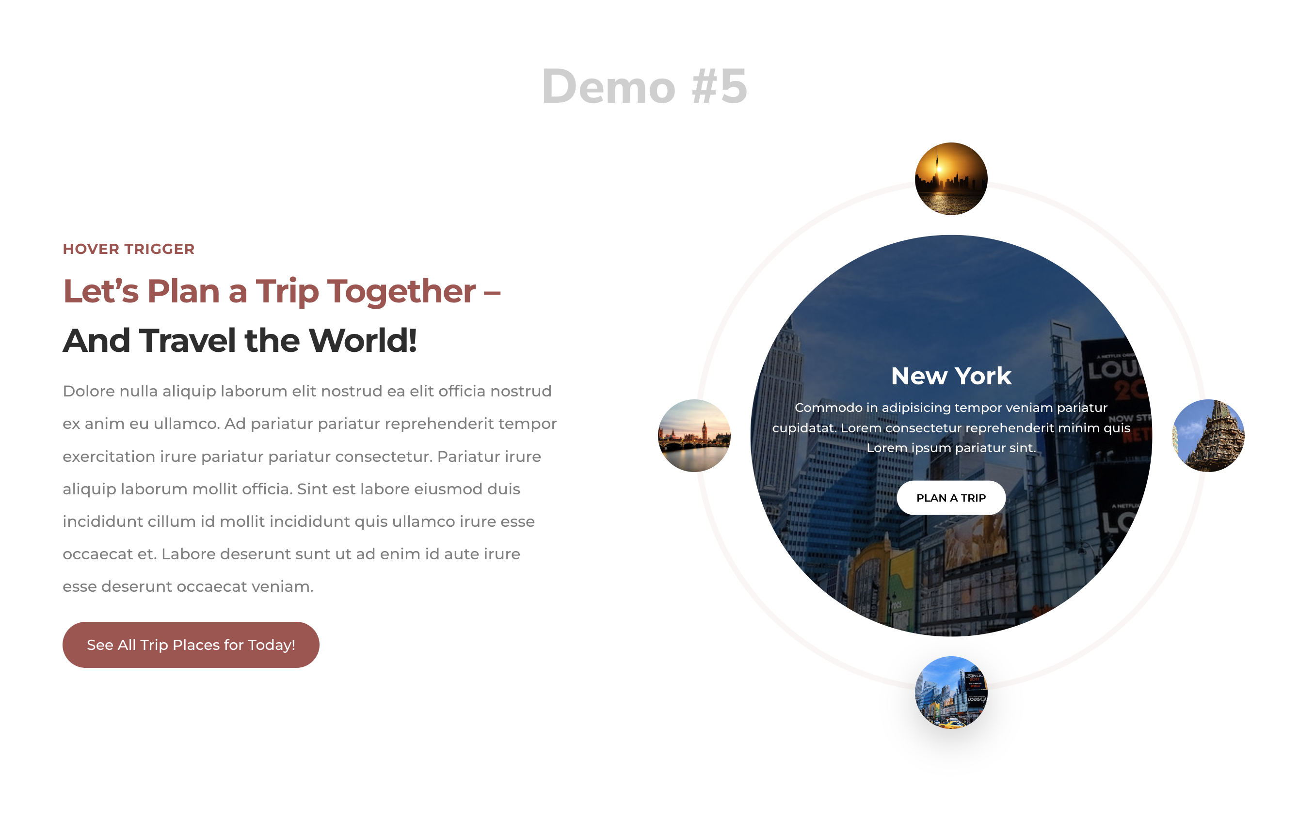
The Divi Supreme Circle Info Module helps you create beautiful, interactive circle information in Divi. You can use it to display important information about your business, service, or product in an engaging way. The module is easy to use and comes with a variety of customization options. With the Divi Supreme Circle Info Module, you can create a unique and informative way to present your business or product.
Content Options
Adding Circle Info Items
Click on + Add new Item to add your first Circle Info Item . Clicking + Add new Item will open a completely new list of design settings (including Content, Design, Advanced) for your new Circle Info Item.
See below for individual Circle Info Item settings.
After you add your first Circle Info Item, you will see a gray bar Circle Info Item near with the title of your Circle Info shown as a label. The gray bar also has three buttons that allow you to edit, duplicate, or delete the Circle Info Item.
General
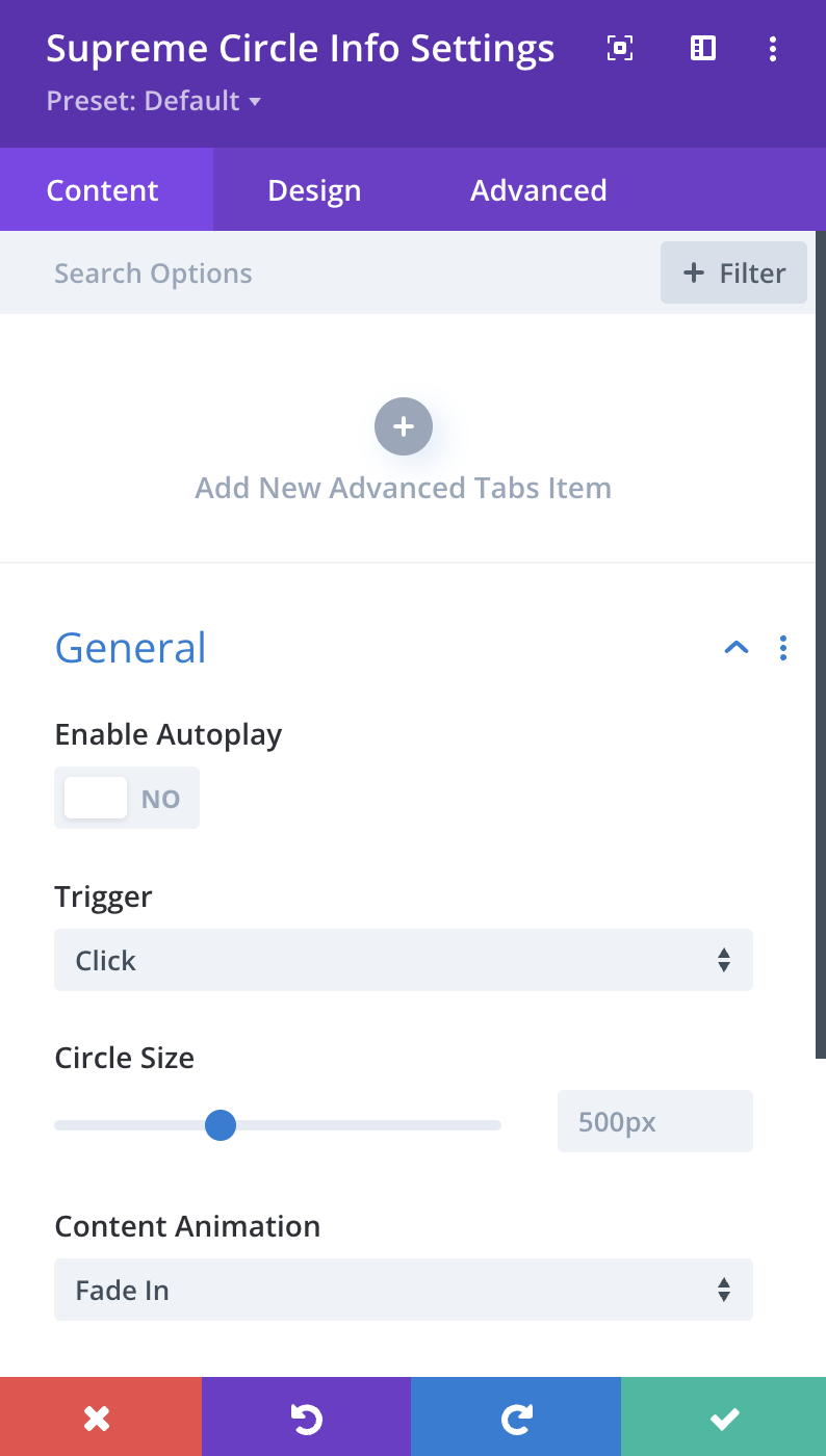
Enable Autoplay
You can enable the use of Autoplay on Circle Info Items, and items will change after the specified time.
--Speed
Here you can adjust the speed of the Autoplay.
--Delay
Here you can adjust the delay of the Autoplay.
Trigger
Choose whether you want to change Circle Info on Click or Hover.
Circle Size
Here you can adjust the size of the Circle, you can enable Responsive option to adjust the size for Mobile Devices.
Content Animation
Here you can change the Animation of the Content from 30+ Animations.
Design Options
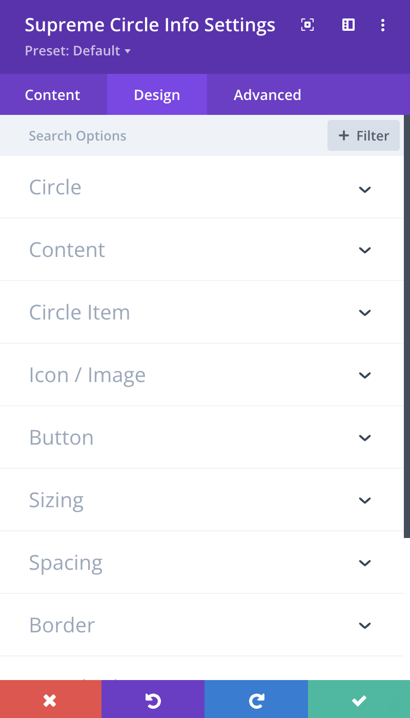
Circle
Here you can customize the Circle by adding Border, Border Radius & Box Shadow etc.
Content - General Tab
Here you can customize the Content Info by adding Padding, Border, Border Radius & Box Shadow etc.
Content - Title Tab
Here you can customize the Title of Content by changing its font, size, color and weight etc.
Content - Description Tab
Here you can customize the Description of Content by changing its font, size, color and weight etc.
Circle Item - General Tab
Circle Size
Here you adjust the size of the Circle Item that shows with the Circle line as a Circle!
Else you can customize the Title of Circle Item by changing its font, size, color and weight etc.
Circle Item - Normal Tab
Background Color
Here you can change the Background color for the Circle Item - Normal State.
** Color**
Here you can change the Title/Icon color for the Circle Item - Normal State.
Else you can customize Normal State by adding Border, Border Radius & Box Shadow etc.
Circle Item - Active Tab
Background Color
Here you can change the Background color for the Circle Item - Active State.
** Color**
Here you can change the Title/Icon color for the Circle Item - Active State.
Else you can customize Active State by adding Border, Border Radius & Box Shadow etc.
Image & Icon - Icon Tab
Icon Size
Here you can adjust the size of the Icon.
Background Color
Here you can change the Background color of the Icon - Normal State.
Active Background Color
Here you can change the Background color of the Icon - Active State.
Color
Here you can change the color of the Icon - Normal State.
Active Color
Here you can change the color of the Icon - Active State.
Else you can customize the Icon by adding Margin/Padding, Border, Border Radius & Box Shadow etc.
Image & Icon - Image Tab
Image Width
Change the Image Width here.
Else you can customize the Image by adding Border, Border Radius & Box Shadow etc.
Button
Enable Use Custom Styles for the button to add custom styling to the button. You can design the button same way you always design your Divi Buttons you can change button, font, size, weight and more and play with Margin and Padding and also you can add Corner Radius, Border and Box Shadow to the button.
Advanced Options
Use the advanced options to give your Circle Info module custom CSS ID’s and Classes. Add some custom CSS for advanced styling and designate the module's visibility on certain devices.
Circle Info Item Content Options
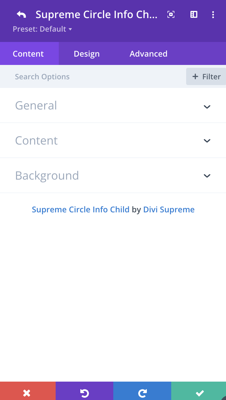
General
Title
Here you can add your Title for the Circle Item.
Use Icon
Enable this option If you'd like to use Icon, you can disable it to use your own custom image.
Content
Title
Your Title for Content goes here.
Content
Here you can add your Description for Content.
Button Text
If you'd like to add a Button, simply add in Button Text here.
Button URL
Change the Button URL here.
Button Link Target
Change the Button Link Target to either open in "Same Window" or in a "New Tab".
Circle Info Item Design Options
Circle Item - General Tab
Here you can customize the Title of Circle Item by changing its font, size, color and weight etc for this specific item.
Circle Item - Normal Tab
Here you can customize Normal State by adding Border, Border Radius & Box Shadow etc for this specific item.
Circle Item - Active Tab
Here you can customize Active State by adding Border, Border Radius & Box Shadow etc for this specific item.
Content - General Tab
Here you can customize the Content Info by adding Padding, Border, Border Radius & Box Shadow etc.
Content - Title Tab
Here you can customize the Title of Content by changing its font, size, color and weight etc.
Content - Description Tab
Here you can customize the Description of Content by changing its font, size, color and weight etc.
Image & Icon - Icon Tab
Icon Size
Here you can adjust the size of the Icon.
Background Color
Here you can change the Background color of the Icon - Normal State.
Active Background Color
Here you can change the Background color of the Icon - Active State.
Color
Here you can change the color of the Icon - Normal State.
Active Color
Here you can change the color of the Icon - Active State.
Else you can customize the Icon by adding Margin/Padding, Border, Border Radius & Box Shadow etc.
Image & Icon - Image Tab
Image Width
Change the Image Width here.
Else you can customize the Image by adding Border, Border Radius & Box Shadow etc.
Button
Enable Use Custom Styles for the button to add custom styling to the button. You can design the button same way you always design your Divi Buttons you can change button, font, size, weight and more and play with Margin and Padding and also you can add Corner Radius, Border and Box Shadow to the button.
Circle Info Item Advanced Options
Use the advanced options to give your Circle Info Item custom CSS ID’s and Classes. Add some custom CSS for advanced styling and designate the module’s visibility on certain devices.
Enhancing Circle Info Responsiveness for Mobile/Tablet View
To optimize the circle info for mobile and tablet devices, consider enabling the responsive option and manually resizing the Circle Size. For visual guidance, a helpful video has been provided below.
Note: The appearance in Divi Builder may differ, but the circle info should display correctly on the front end.