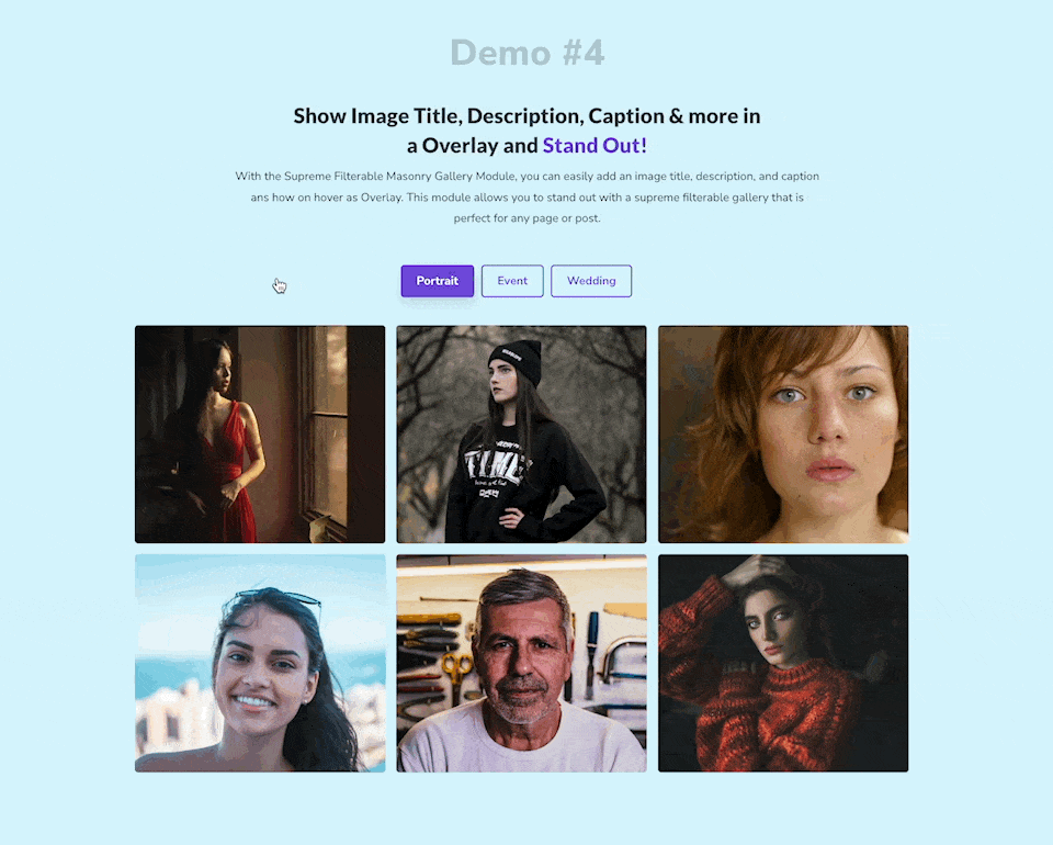
Divi Supreme Filterable Gallery Module
With Divi Supreme Filterable Gallery Module, you can easily create Beautiful Filterable Galleries in Divi. This module is packed with features and options that allow you to create amazing galleries without having to code. You can also quickly and easily filter your Images by Categories assigned to the image.
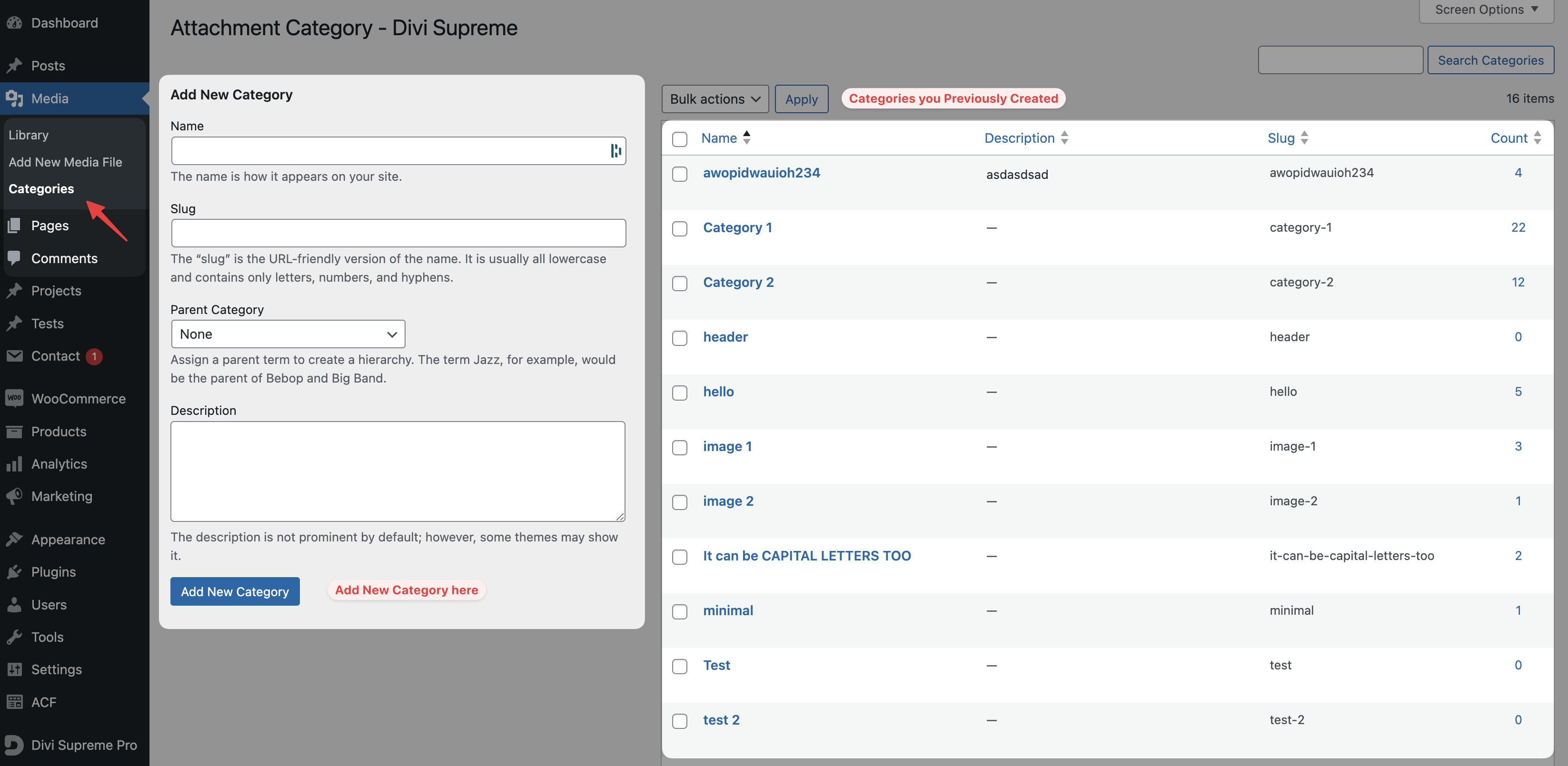
Creating New Categories for Filters
To Create new categories for Filters, go to Dashboard -> Media -> Categories and here you can create new categories and also edit the categories you previously created.
Assigning Categories to Images
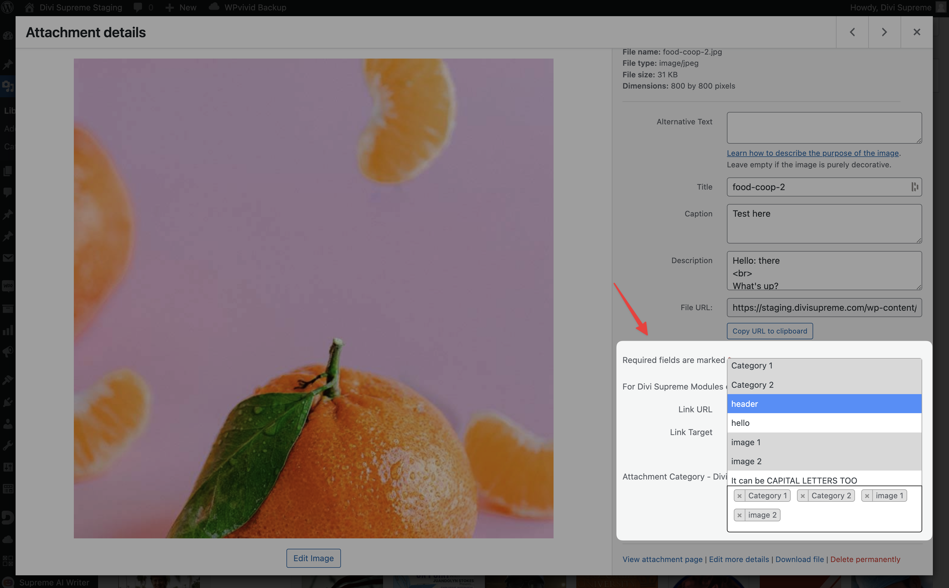
We have made this super easy in the latest update to assign categories to Images. We have added a new Category select option with search feature allowing you to easily add the correct category to the image.
To add a category/categories to an image, simply open that image in the Media Library and on the right sidebar you'll be able to assign your desired categories.
You can assign categories to an image while in Divi Builder as well, simply click the + Icon in the Filterable Gallery Module settings to add a new Image from the Media Library and then on the right sidebar you can assign your categories.
Content Options
General
Use Dynamic Images Enabling this option will give you the list of categories that you can select to show the images of only the selected categories.
Images
You can also manually upload your images here as many as you want. The main advantage of this is that you can rearrange the images however you like simply with drag & drop.
Number of Columns
Here you can choose the Number of Columns for Images.
Image Size
You can change the Image Size from here from different presets.
Column Gap
Here you can increase/decrease the Column gap between images.
Row Gap
Here you can increase/decrease the Row gap between images.
Speed
Here you can control the Speed when Filtering Images.
Layout
Here you can select the Layout, either "Card" or "Overlay".
*When using "Overlay", you'll see below options:
Image Height
Here you can change the Height of the Image manually.
Hover
Change the Hover style here, you can select "Fade In" or "Zoom" or "None".
Hover Transition
Change the Transition period of the Hover Effect here.
Elements
Enable Filterable Gallery
Enable/Disable If you want to have Filters at the top.
Show All Images Text
If you want to show the "All" tab, where all the images will be displayed, you can enable this option.
--All Images Text
You can also set a custom Text for "All" tab.
Show Title
Enable this option If you'd like to show Image Title in the Gallery, you can assign this Title in the Media Library for each image.
Show Caption
Enable this option If you'd like to show Image Caption in the Gallery, you can assign this Caption in the Media Library for each image.
Show Description
Enable this option If you'd like to show Image Description in the Gallery, you can assign this Description in the Media Library for each image.
Use Lightbox
You can enable this option If you'd like to show Gallery images in the Lightbox.
Show Pagination
If you got many images and want to pagination so the user won't have to scroll much, you can enable this option. You can change the Type of Pagination in the "Pagination" panel.
Configuration
Items Per Page
Here you can set how many images you'd like to show per page.
Pagination
Pagination Type
Here you can change the Pagination type to either "Load More" button or "Numbered Pagination".
Design Options
Title
Here you can customize the Title font, size, color and weight etc.
Caption
This is where you can customize the Content Caption by changing its font, size, color and weight etc.
Description
This is where you can customize the Content Description by changing its font, size, color and weight etc.
Card
There is where you can customize the Layout when using "Card" type.
Background Color
Here you can change the Background color of the Card.
Padding
Here you can add padding to the Card.
Else you can customize the Card by adding Border, Border Radius & Box Shadow etc.
Image
Margin
Here you can add Margin to the Image
Padding
Here you can add Padding to the Image.
Else you can customize the Image by adding Border, Border Radius & Box Shadow etc.
Content Wrapper
Margin
Here you can add Margin to the Content Wrapper.
Padding
Here you can add Padding to the Content Wrapper.
Else you can customize the Content Wrapper by adding Border, Border Radius & Box Shadow etc.
Overlay
Background Color
Here you can change the Background Color of the Overlay that shows on hover when using "Overlay" type.
Padding
Here you can add Padding to the Overlay.
Category Tab
Alignment
Here you can change the Alignment of the Category Tabs.
Inactive BG Color
Here you can change the Background color for Tabs for "normal" state.
Active BG Color
Here you can change the Background color for Tabs for "Active" state.
Inactive Color
Here you can change the Text color for Tabs for normal state.
Active Color
Here you can change the Text color for Tabs for normal state.
Margin
Here you can add Margin to the Category Tabs.
Padding
Here you can add Padding to the Category Tabs.
Else you can customize the Tabs by changing Font Size, color, weight and even adding Border, Border Radius & Box Shadow etc for "Normal" & "Active" state.
Pagination
Here you can customize the Numbered Pagination.
Inactive BG Color
Here you can change the Background color for Pagination for "normal" state.
Active BG Color
Here you can change the Background color for Pagination for "Active" state.
Inactive Color
Here you can change the Text color for Pagination for normal state.
Active Color
Here you can change the Text color for Pagination for normal state.
Margin
Here you can add Margin to the Pagination.
Padding
Here you can add Padding to the Pagination.
Alignment
Here you can change the Alignment of the Pagination.
Else you can customize the Pagination by changing Font Size, color, weight and even adding Border, Border Radius & Box Shadow etc for "Normal" & "Active" state.
Load More
Here you can customize the Load more button.
Background Color
Change the Background color of the Load more button here.
Margin
Here you can add Margin to the Load More button.
Padding
Here you can add Padding to the Load More button.
Else you can customize the Load More by changing Font Size, color, weight and even adding Border, Border Radius & Box Shadow etc.
Advanced Options
Use the advanced options to give your Step Flow module custom CSS ID’s and Classes. Add some custom CSS for advanced styling and designate the module's visibility on certain devices.
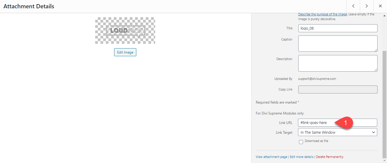
How to add URL to each Image in the Gallery?
If you want to add a URL to each Image in the gallery, you can do that easily. All you've to do is open up that Image in the Media Library and add the Custom URL to it there. So when a user will click on the Image they’ll be taken to that URL that you added to Image. It will only work within Divi Supreme Modules.