Divi Image Hotspots Module
Adding Beautiful Image Hotspots was never easier in Divi Builder but now it’s super easy. Image Hotspots Module will let you add Hotspots to your image, if you ever wondered to add more info to your image then this module will be helpful.
 # Content Options
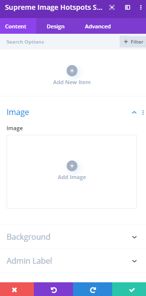
Image
First thing first, you will have to add an image here from your Media Library and then start adding Hotspots to the image.
Adding Hotspots to the Image
Click on + Add new Item to add your first hotspot to the Image. Clicking + Add new Item will open a completely new list of design settings (including Content, Design, Advanced) for your new Image Hotspot.
See below for individual Image Hotspot Item settings.
After you add your first Hotspot, you will see a gray bar appear with the title of your Image Hotspot shown as a label. The gray bar also has three buttons that allow you to edit, duplicate, or delete the image hotspot.
Design Options
If you want to make all your hotspots look the same then you can style them from here not Item Design Options but if you want to make them look different from each other then style each of them from the Item Design Options. All the Designs you’ll do here will be applied to all Hotspots.
Hotspot text
If you have Hotspot type text then here you’ll be able to change its color, size and weight, etc.
Hotspot Settings
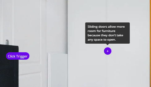
Trigger Event
Here you can change the hotspot trigger event. You have two options:
- Mouse Enter - Will show the tooltip on hover.
- Mouse Enter & Click - Will show the Tooltip on Hover and even If you click on the Hotspot It will keep showing.
- Mouse Enter & Focus - Will show the Tooltip on Hotspot Hover and If you click on the hotspost will hide the Tooltip.
- Click - Will show the tooltip on click.
- Click & Focus - Will show the tooltip on click, Click on hotspost again will hide the Tooltip.
Padding
Here you can add padding to the Hotspot.
Border Radius and Border
Add some border-radius and Simple Borders to the hotspot.
Hotspot Icon
Icon Color
Change the color of the Icon here.
Icon font Size
Change the size of the Icon from here.
Tooltip Settings
Background Color
Add a Background color here to the tooltip.
Tooltip Padding
Add some padding to the tooltip here.
Tooltip Max Width
Change the max-width of the Tooltip here.
Tooltip Delay Show
Add some delay for the tooltip to show by just sliding the slider.
Tooltip Delay Hide
Add some delay for the tooltip to hide by just sliding the slider.
Tooltip Heading Text
If you have added Heading text in the Text of the Tooltip then you can style that here the same you style other Heading texts in Divi.
Tooltip Body Text
Here you can style the Tooltip Body text. You can change the font color, size, weight and more.
Image
Alignment
Change the alignment of the image here.
Image Box Shadow
Add Shadow to the image here.
Sizing
Force Fullwidth
Enabling this option will Force the image to be fullwidth. After that if you want to control the width of the image according to your custom needs you'll then see Width Option to do so.
Hotspot Item Content Options
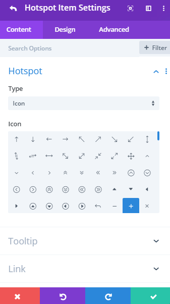 ## Hotspot
**Type**
## Hotspot
**Type**
Change the type of the Hotspot button. It can an Icon or Text.
- Icon - If you'll select Hotspot type as Icon you can then choose an Icon for the Hotspot from Divi Icon Library.
- Image - If you'll select Hotspot type as Icon you can then choose an Image from Media Library to use as Hotspot.
- Hotspot Text - If you select Hotspot type to Text a text input field will appear and you’ll be able to add text to Hotspot than Icon.
Tooltip
Use Tooltip
Enable this Option, If you'd like to use Tooltip on Hover. You can disable it If you don't want to show Tooltip on hover.
Content
Here you’ll be able to add text to appear in the tooltip.
Background
Here you can change the background color of the Hotspot, you can add a solid Color, Gradient, Image or Video the Hotspot.
Hotspot Item Design Options
Hotspot Text
If you have chosen the Hotspot type as Text then you’ll be able to style that text here the same way as you always style.
Hotspot Settings
Left Position
Using this Position option you’ll be able to move the Hotspot from right to left or left to right by sliding the slider.
TOP Position
Using this Position option you’ll be able to move the Hotspot from top to bottom or bottom to top by sliding the slider.
Padding
Add some padding to the hotspot to let it take more space on the image.
Border Radius and border
Here you can add border-radius or simple border to the hotspot.
Hotspot Image
If you'll choose Hotspot Type as Image this will appear to style the Image.
Hotspot Image width
Here you can change the width of the Image
Hotspot Image Rounded Corners
Add Rounded corners to Image here.
Hotspot Image Border
Here you can add Border to the Image.
Hotspot Image Box Shadow
Add Shadow to image here to make it look more natural.
Hotspot Icon
If you'll choose Hotspot Type as Icon this will appear to style the Icon.
Icon Color
Change the color of the Icon here.
Icon font Size
Change the size of the Icon from here.
Tooltip Settings
When you’ll hover over to the hotspot a tooltip shows and that can be styled here.
Tooltip Animation
Here you can choose an animation for the Tooltip from 5 different animations.
Background color
Change the tooltip background color here.
Padding
Add some padding to the tooltip here.
Placement
Here you can choose the placement of the tooltip. The Tooltip can be placed on Top, Bottom, Left or Right of the Hotspot.
Tooltip Max Width
Change the max-width of the Tooltip here.
Tooltip Heading Text
If you have added Heading text in the Text of the Tooltip then you can style that here the same you style other Heading texts in Divi.
Tooltip Body Text
Here you can style the Tooltip Body text. You can change the font color, size, weight and more.
Tooltip Item Advanced Options
Use the advanced options to give your Image Hotspot module custom CSS ID’s and Classes. Add some custom CSS for advanced styling and designate the module’s visibility on certain devices.