Divi Flipbox Module
With over 15 effects to choose from, you can now create stunning interactive content that converts.
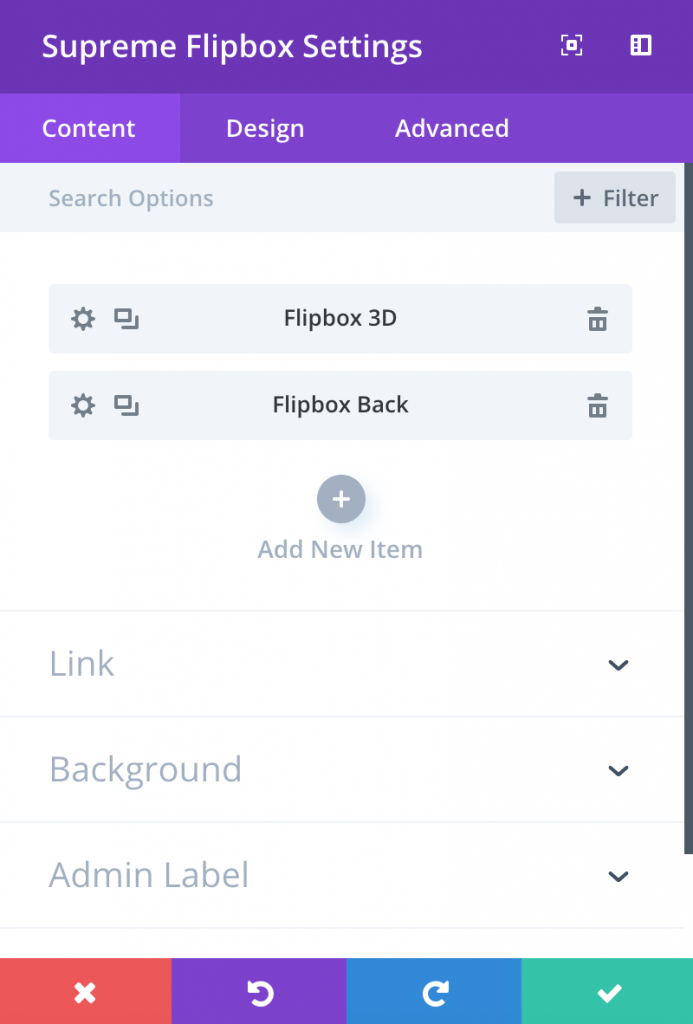
 # Content Options
**+ Flipbox Item**
# Content Options
**+ Flipbox Item**
This is where you add content, images and icon to your Flipbox Module. Just like a Blurb Module but with Front and Back Animation to show the front and back of an element when you hover. Clicking “add new item” will open a completely new list of design settings (including Content, Design, Advanced) for your new Flipbox. See below for individual Flipbox settings.
After you add your first image, you will see a gray bar appear with the title of your Flipbox shown as a label. The gray bar also has three buttons that allow you to edit, duplicate, or delete the image.
Note: Create only two items because one is identify as Front and the other as Back.
Design Options
Sizing
--Height
By default, the flipbox is set at 200px. You can set to other height to suit the content of your flipbox. This is one of the most important part when using flipbox. If you content is too long and doesn’t look right. Adjust your height.
Animation
This is where you can change the flipbox animation effect.


Trigger Animation On
Choose a trigger animation for the Flipbox here. You can either select "Hover" or "Click". When you'll select Click the Flipbox will flip on Click instead of on hover.
Click On
This option will appear once you'll select the Trigger method as "Click". And from here you can choose If you want to flip the Flipbox on Whole Flipbox click or Button click.
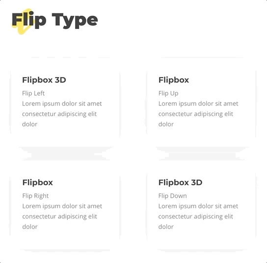
Flipbox Type
There are 5 types of Flipbox Effect to choose from.
- Flip
- Slide
- Zoom In
- Zoom Out
- Fade
- See Flipbox Demo here.
Flip Animation
There are 4 types of Flip Effect to choose from. "Flip Left" "Flip Right" "Flip Up" "Flip Down"
3D Effect
This option will only show up when you choose Flipbox Effect as Flip And this will create a 3D effect to your Flipbox.
Slide Animation
This option will only show up when you choose Flipbox Effect as Slide
There are 4 types of Slide Effect to choose from. "Slide Left", "Slide Right", "Slide Up" and "Slide Down".
Zoom In Animation
This will have a zoom in animation on your flipbox.
Zoom Out Animation
This option will only show up when you choose Flipbox Effect as Zoom Out
There are 5 types of Zoom Out Effect to choose from. Zoom Out Zoom Out Up Zoom Out Down Zoom Out Left * Zoom Out Right
Animation Speed (in s)
This will control the speed animation of the flipbox.
Advanced Options
Use the advanced options to give your text module custom CSS ID’s and Classes. Add some custom CSS for advanced styling and designate the module’s visiblity on certain devices.
Flipbox Item Content
Title
Give a title to your Flipbox that will appear above the body text of the Flipbox in a bold text style.
Sub Title
If you would like to use a sub title, add it here. Your sub title will appear below your title in a small font.
Content
This field is where you can enter the body content of your Flipbox. Flipbox Text will also span the full width of your column.
Use Icon
When using Flipbox, you can choose to either use an Icon or and Image with your text. If you select “yes” for the “Use Icon” option, then you will be presented with the following options to customize your icon. If you do not choose to use an Icon, then you will be prompted to upload an image instead.
Icon
If you chose “yes” for the “Use Icon” setting, then this option will appear. This options presents you with a list of available icons that you can use with your Perky Animate text. Simply click on the con that you would like to use and it will appear in your Flipbox.
Image
If you did not choose to use an Icon, then this setting will appear. Place a valid image url here, or choose/upload an image via the WordPress Media Library. However, your image will never scale larger than its original upload size. The height of the Flipbox image is determined by the aspect ratio of your original image, so making all of your Flipbox images the same height is a good idea if you are placing them side by side.
Button
Button Text
Input your desired button text.
Button URL
Input the destination URL for your button.
URL Opens
Here you can choose whether or not your link opens in a new window.
Flipbox Item Design Options
Within the design tab you will find all of the module’s styling options, such as fonts, colors, sizing and spacing. This is the tab you will use to change how your module looks. Every Divi module has a long list of design settings that you can use to change just about anything.
Image & Icon
Icon Color
If you chose “yes” for the “Use Icon” setting, then this option will appear. This option allows you to customize the color of your Icon. By default, the icons are set to your theme accent color.
Circle Icon
If you chose “yes” for the “Use Icon” setting, then this option will appear. This options allows you to place your icon within a colored circle. If you select “yes” for this setting, then you will be presented with additional options for customizing your circle color and border.
Circle Color
If you chose “yes” for the “Circle Icon” setting, then this option will appear. Here you can pick a color to use for your circle. This color is independent from your Icon color selected earlier. You icon, in it’s color, will appear inside this a circle with the color you select here.
Show Circle Border
If you chose “yes” for the “Circle Icon” setting, then this option will appear. This option allows you to turn on a border for your circle. If selected, an additional option will appear to select your border color.
Circle Border Color
If you chose “yes” for the “Show Circle Border” setting, then this option will appear. Here you can adjust the color of the circle border.
Use Icon Font Size
If enabled, you can input a custom size for the icon that is displayed.
Sizing
Here you can change the width of the image.
Width
Applying a max width value here will limit the width of the Flipbox image. This only affects Flipbox that are not in icon mode.
Spacing
Custom Padding
Padding is the space added inside of your flipbox item, between the edge of the file and its internal elements. You can add custom padding values to any of the flipbox item’s four sides. To remove custom margin, delete the added value from the input field. By default these values are measured in pixels, but you can input custom units of measurement into the input fields.
Flipbox Item Advanced Options
Use the advanced options to give your text module custom CSS ID’s and Classes. Add some custom CSS for advanced styling and designate the module’s visiblity on certain devices.