Supreme FAQ Module
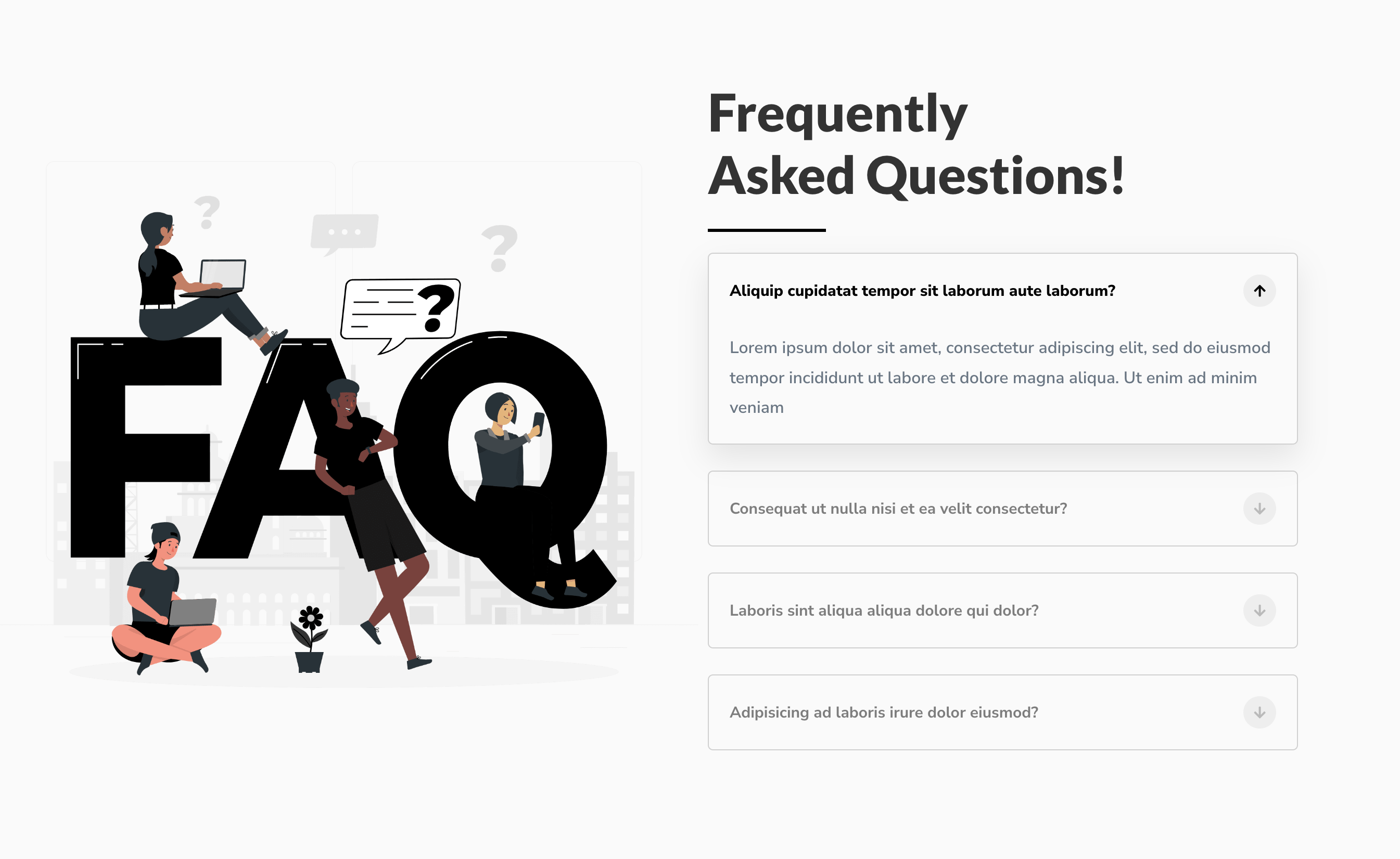
If you’re tired of dull, boring FAQs on your website, it’s time to try something new. With Divi Supreme FAQ module, you can create stunning FAQs that are both informative and visually appealing. There are many styling and content options available, so you can customize your FAQs to match your website’s look and feel.
Content Options
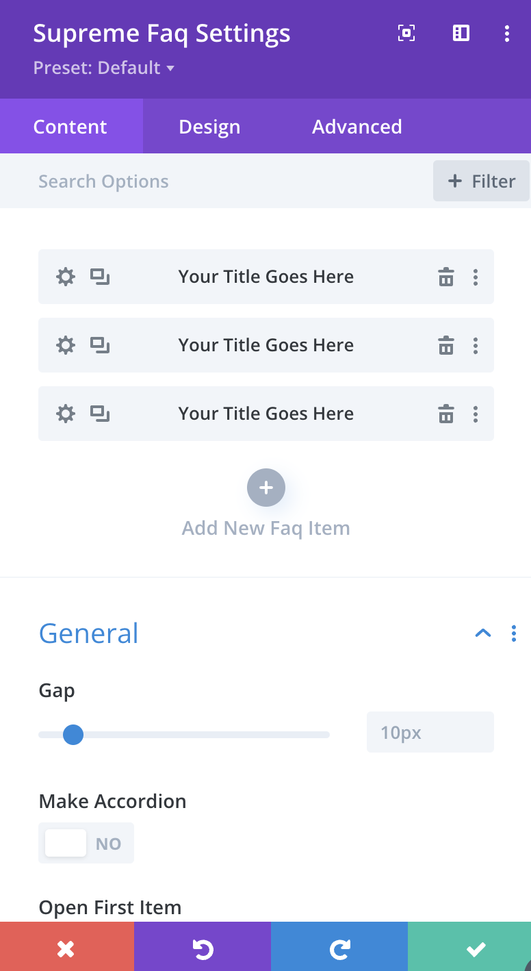
Adding FAQ Items
Click on + Add new Item to add your first FAQ Item . Clicking + Add new Item will open a completely new list of design settings (including Content, Design, Advanced) for your new FAQ Item.
See below for individual FAQ Item settings.
After you add your first FAQ Item, you will see a gray bar FAQ Item near with the title of your FAQ shown as a label. The gray bar also has three buttons that allow you to edit, duplicate, or delete the FAQ Item.
General
Gap
Here you can add a gap between your FAQ Items!
Make Accordion
Enable this option If you'd like to make the FAQs Accordion, with this only one item can be opened at a time, other items will be closed automatically.
Open First Item
Enable this option, If you'd like to have the First Item opened by default.
Enable Schema Support
If you'd like to show your FAQs in Google (& Others) Search Results, then enable this option.
Use Image
If you'd like to use the same Image in the Toggles for all FAQ items, then you can enable this option. A new Panel will appear, where you can add your Image for both states. See In Item settings, If you'd like to have a different image for each item.
Animate Toggle Icons
Enable this option If you'd like to animate the Toggle Icon when you open/close a Toggle.
Toggle Icon
Open FAQ Icon
Select Icon for the FAQ for Open State here.
Close FAQ Icon
Select Icon for the FAQ for Close State here.
Icon Placement
Here you can change the placement of the Icon, If you place it right, It will move the Image to Left (If used) and Icon to right.
Toggle Image
This Panel will only appear If the "Use Image" option is enabled in the "General" Settings.
Open Image
Select Image for the FAQ for Open State here.
Close Image
Select Image for the FAQ for Close State here.
Design Options
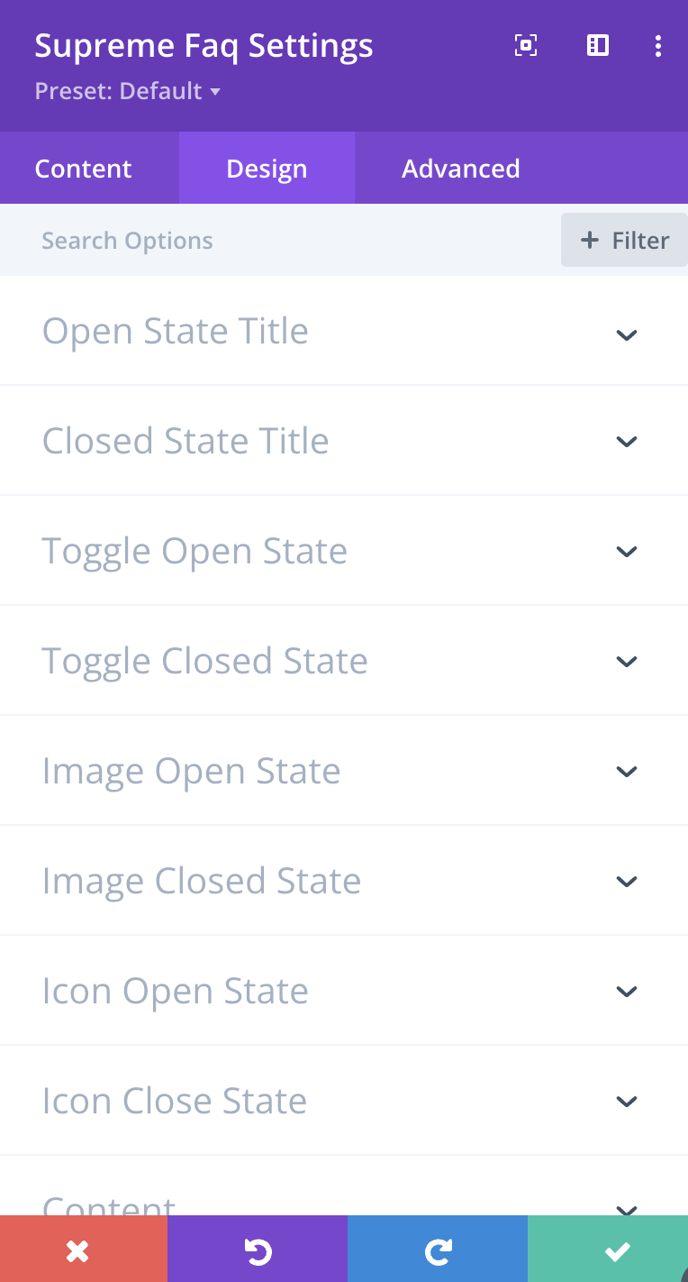
Open State Title
Here you can customize the Open State Title font, size, color and weight etc.
Close State Title
Here you can customize the Close State Title font, size, color and weight etc.
Toggle Open State
Open Background Color
Here you can change the Background Color of the FAQ/Toggle Item - For Open State.
Margin
Add Margin to FAQ/Toggle Items here If you wish - For Open State.
Padding
Add Margin to FAQ/Toggle Items here If you wish - For Open State.
Else you can customize the Toggle Open State by adding Border, Border Radius & Box Shadow etc.
Toggle Close State
Close Background Color
Here you can change the Background Color of the FAQ/Toggle Item - For Close State.
Margin
Add Margin to FAQ/Toggle Items here If you wish - For Close State.
Padding
Add Margin to FAQ/Toggle Items here If you wish - For Close State.
Else you can customize the Toggle Close State by adding Border, Border Radius & Box Shadow etc.
Image Open State
Width
Here you can change the Width of the Image- For Open State.
Margin
Add Margin to the Image here If you wish - For Open State.
Padding
Add Margin to the Image here If you wish - For Open State.
Else you can customize the Image Open State by adding Border, Border Radius & Box Shadow etc.
Image Close State
Width
Here you can change the Width of the Image - For Closed State.
Margin
Add Margin to the Image here If you wish - For Closed State.
Padding
Add Margin to the Image here If you wish - For Closed State.
Else you can customize the Image Closed State by adding Border, Border Radius & Box Shadow etc.
Icon Open State
Open Icon BG Color
Change the Background Color of the Icon here - For Open State.
Open Icon Color
Change the Color of the Icon here - For Open State.
Margin
Add Margin to the Icon here If you wish - For Open State.
Padding
Add Margin to the Padding here If you wish - For Open State.
Open Icon Font Size
Change the Icon Font Size here - For Open State.
Else you can customize the Icon Open State by adding Border, Border Radius & Box Shadow etc.
Icon Close State
Close Icon BG Color
Change the Background Color of the Icon here - For Close State.
Close Icon Color
Change the Color of the Icon here - For Close State.
Margin
Add Margin to the Icon here If you wish - For Close State.
Padding
Add Margin to the Padding here If you wish - For Close State.
Close Icon Font Size
Change the Icon Font Size here - For Close State.
Else you can customize the Icon Close State by adding Border, Border Radius & Box Shadow etc.
Content
This is where you can customize the Content Description by changing its font, size, color and weight etc.
Advanced Options
Use the advanced options to give your Supreme FAQ module custom CSS ID’s and Classes. Add some custom CSS for advanced styling and designate the module's visibility on certain devices.
Supreme FAQ Item Content Options
General
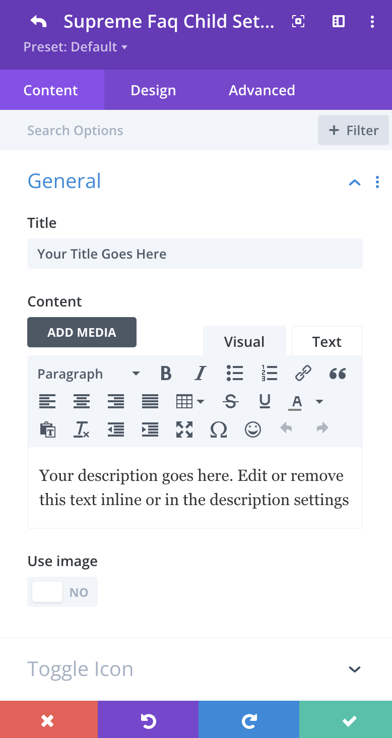
Title
Here you can Add Title for your FAQ Item.
Content
Here you can Add Content for your FAQ Item.
Use Image
If you'd like to use Image in the Toggle for this particular item, then you can enable this option. A new Panel will appear, where you can add your Image for both states.
Toggle Icon
Open FAQ Icon
Select Icon for the FAQ for Open State here.
Close FAQ Icon
Select Icon for the FAQ for Close State here.
Toggle Image
This Panel will only appear If the "Use Image" option is enabled in the "General" Settings.
Open Image
Select Image for the FAQ for Open State here.
Close Image
Select Image for the FAQ for Close State here.
Supreme FAQ Item Design Options
Below Styling Options will only apply to this Particular Item and won't be applied to other Items, to have the same styling for all FAQ Items, use Design Options in the Main Settings.
Open State Title
Here you can customize the Open State Title font, size, color and weight etc.
Close State Title
Here you can customize the Close State Title font, size, color and weight etc.
Toggle Open State
Open Background Color
Here you can change the Background Color of the FAQ/Toggle Item - For Open State.
Margin
Add Margin to FAQ/Toggle Items here If you wish - For Open State.
Padding
Add Margin to FAQ/Toggle Items here If you wish - For Open State.
Else you can customize the Toggle Open State by adding Border, Border Radius & Box Shadow etc.
Toggle Close State
Close Background Color
Here you can change the Background Color of the FAQ/Toggle Item - For Close State.
Margin
Add Margin to FAQ/Toggle Items here If you wish - For Close State.
Padding
Add Margin to FAQ/Toggle Items here If you wish - For Close State.
Else you can customize the Toggle Close State by adding Border, Border Radius & Box Shadow etc.
Image Open State
Width
Here you can change the Width of the Image- For Open State.
Margin
Add Margin to the Image here If you wish - For Open State.
Padding
Add Margin to the Image here If you wish - For Open State.
Else you can customize the Image Open State by adding Border, Border Radius & Box Shadow etc.
Image Close State
Width
Here you can change the Width of the Image - For Closed State.
Margin
Add Margin to the Image here If you wish - For Closed State.
Padding
Add Margin to the Image here If you wish - For Closed State.
Else you can customize the Image Closed State by adding Border, Border Radius & Box Shadow etc.
Icon Open State
Open Icon BG Color
Change the Background Color of the Icon here - For Open State.
Open Icon Color
Change the Color of the Icon here - For Open State.
Margin
Add Margin to the Icon here If you wish - For Open State.
Padding
Add Margin to the Padding here If you wish - For Open State.
Open Icon Font Size
Change the Icon Font Size here - For Open State.
Else you can customize the Icon Open State by adding Border, Border Radius & Box Shadow etc.
Icon Close State
Close Icon BG Color
Change the Background Color of the Icon here - For Close State.
Close Icon Color
Change the Color of the Icon here - For Close State.
Margin
Add Margin to the Icon here If you wish - For Close State.
Padding
Add Margin to the Padding here If you wish - For Close State.
Close Icon Font Size
Change the Icon Font Size here - For Close State.
Else you can customize the Icon Close State by adding Border, Border Radius & Box Shadow etc.
Content
This is where you can customize the Content Description by changing its font, size, color and weight etc.
Timeline Item Advanced Options
Use the advanced options to give your FAQ Item custom CSS ID’s and Classes. Add some custom CSS for advanced styling and designate the module’s visibility on certain devices.