Divi Menu Module
Display your WordPress menu and design it in whatever way you want. Use it for Footer or Sidebar.

Content Options
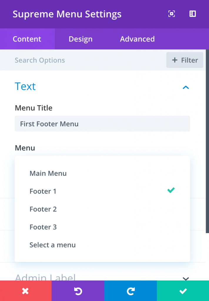
Menu Title
This field is where you can enter the title of your menu.
Menu
Select a menu that should be used in the module. You can create new menus using the Appearances > Menus page in your WordPress Dashboard. Each time you create a new menu, the menu will be selectable in this dropdown menu.
Collapse Sub Menu
Enable this Option If you'd like to collapse the Sub Menu and that will reveal when you click on the Parent Menu Item.

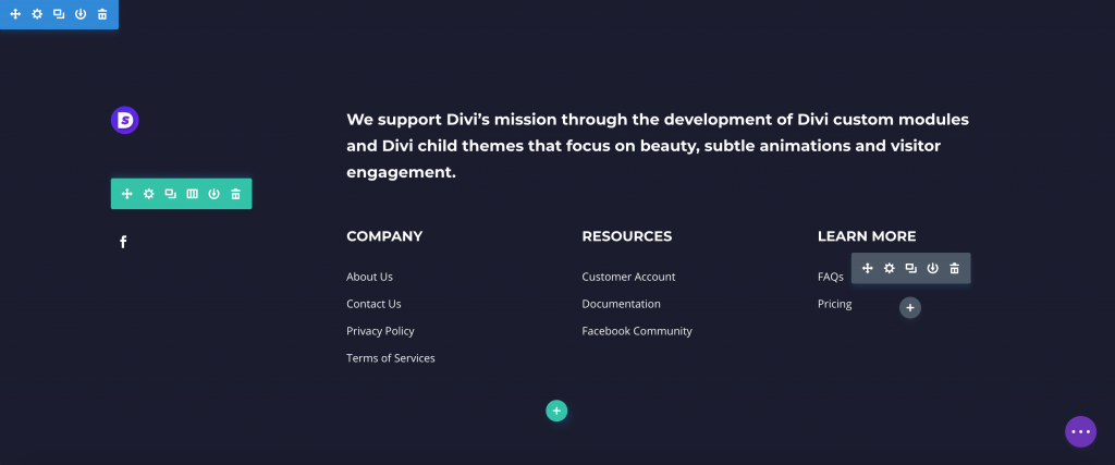
An example how we use the menu module with the Footer Template to design our Footer

Admin Label
This will change the label of the module in the builder for easy identification. When using WireFrame view in the Visual Builder, these labels will appear within the module block in the Divi Builder interface.
Design Options
Within the design tab you will find all of the module’s styling options, such as fonts, colors, sizing and spacing. This is the tab you will use to change how your module looks. Every Divi module has a long list of design settings that you can use to change just about anything.
Layout
Menu Layout
Currently the available Menu Layout is vertical.
Title
Here you can style the Title text of the Menu Module
Bottom Gap
Add some spacing under the Title text of the Module.
And you can then change the color, font, weight and more of the Title text.
Menu
Menu Link Color
Here you can choose the color of the Menu Items
Active Link Color
Change the Active Menu Link Color here.
Menu Link Active Color
Change the color of the Active Menu Item here.
Menu Link Visited Color
Change the color of the Menu Item a user already visited. When a user opens a link and come back to that page where this Menu Module is added, the color of that Menu item the user just visited will be changed.
Space Between
Add some space between Menu Items here
Left Spacing
Add some spacing on the Left side of the Menu Items.
List Style Type
Here you can change the List style of the Menu Items to Disc, Circle, Decimal and Square. You can choose None if you don't want List style.
List Style Position
You can either choose Inside or Outside means If you've got longer text in the Menu item the text will go below the Disc (or any type you choose) and If you'll choose Outside option it will not show the text below the Disc the text will be shown below the Menu Item text.
List style Color
Change the color of the List bullets here.
And then you play around with changing Font, size, weight and more of the Menu Items.
Sub Menu
If there's a sub menu in the Menu you've added, then you can style those submenus here.
Left Spacing
Add some spacing on Left of of the Sub Menu Item(s).
And then you play around with changing Font, size, weight and more of the Sub Menu Items.
Sub Menu Collapse
From here you'll be able to style the Sub Menu Collapse Icon easily.
Arrow Color
Here you'll be able to change the Icon color.
Arrow Background Color
You can change the Arrow Background color from here.
Arrow Gap
Change the Arrow gap between the Menu Item and Arrow Icon.
Arrow Padding
You can add Padding to the Icon from here, Useful If you've added Background to the Icon.
Arrow Font Size
You can change the Icon font size from here.
Arrow Border, Border Radius and Box Shadow
And else you can add border radius, boc shadow and Border to the Icon easily.
Animation
Use Link Hover Animation
Enable this option to add a Hover animation to Menu Items.
Animation Type
Change the Type of the animation of the Animation here. Currently there's only Underline available we'll be adding more in upcoming updates.
Underline Animation
Here you can change the direction of the Underline Animation. You can change the direction of the Underline from 3 different types:
- Left to Right
- Right to Left
- Center Out
Link Color
Change the color of the Underline here.
Advanced Options
Use the advanced options to give your text module custom CSS ID’s and Classes. Add some custom CSS for advanced styling and designate the module’s visiblity on certain devices.
