Divi Supreme Button Module
Allow you to have two buttons with a separator text in between. 10 types of hover animation to choose from, image/video lightbox that supports: YouTube, Vimeo and Dailymotion! Not only that, we added URL link type that supports: URL, Email, Phone, SMS, Facebook Messenger, Skype, WhatsApp and Telegram!
Content Options
Within the content tab, you will find all of the module’s content elements, such as text, images and icons. Anything that controls what appears in your module will always be found within this tab.

Text
Button #1 Text
Input your desired button #1 text.
Button #2 Text
Input your desired button #2 text.
Links
Link Type for Button #1
Choose the type of URL (URL, Email, Phone, SMS, Facebook Messenger, Skype, WhatsApp or Telegram)
This option will show up only when using Email Type. Enter the Email Address for Button #1.
Download File
Using this Option you can easily add a Click to download feature to the Button, Simply upload any file or Choose from Media Library.
CC
Enter the carbon copy email address for Button #1.
BCC
Enter the blind carbon copy email address for Button #1.
SUBJECT
Enter the default subject of the email for Button #1.
MESSAGE
Enter the default body message of the email for Button #1.
Phone Number
Enter the phone number to call for Button #1 (This will usually work on mobile phones)
SMS
Enter the phone number to SMS for Button #1 (This will usually work on mobile phones)
Facebook Messenger
---USERNAME
This option will show up only when using Facebook Messenger. Enter a person, page, or bot username.
Skype
---USERNAME
This option will show up only when using Skype. Enter the Skype username for Button #1.
ACTION TYPE
Choose the action type for Skype. You can choose to chat or call.
---NUMBER
This option will show up only when using WhatsApp. Enter the phone number to message directly via WhatsApp message for Button #1.
ACTION TYPE
Enter the default body message of the WhatsApp for Button #1.
Telegram
---TELEGRAM USERNAME
This option will show up only when using Telegram. Enter the Telegram Username.
MESSAGE
Enter the default body message of the Telegram for Button #1.
Button #1 URL
Input the destination URLfor your button #1.
Open as Image Lightbox
Here you can choose whether or not the button should open in Lightbox. Note: if you select to open the button in Lightbox, URL options below will be ignored.
Open as Video Lightbox
Put the Video link on the Button #1 URL. Copy the video URL link and paste it here. Support: YouTube, Vimeo and Dailymotion.
Use Tooltip
This will show a tooltip on your Button #1
TOOLTIP CONTENT
Input your desired tooltip content for button #1.
SHOW ARROW
If enabled, then an arrow will be added to the tooltip.
SIZE
The size of the tooltip from Small to Large.
PLACEMENT
Here you can choose the placement of the tooltip. Top, Right, Bottom and Left.
ANIMATION
Here you can choose different types of animation for your tooltip.
URL Opens
Here you can choose whether or not your link opens in a new window.
Link Type for Button #2
Choose the type of URL (URL, Email, Phone, SMS, Facebook Messenger, Skype, WhatsApp or Telegram)
This option will show up only when using Email Type. Enter the Email Address for Button #2.
Download File
Using this Option you can easily add a Click to download feature to the Button, Simply upload any file or Choose from Media Library.
CC
Enter the carbon copy email address for Button #2.
BCC
Enter the blind carbon copy email address for Button #2.
SUBJECT
Enter the default subject of the email for Button #2.
MESSAGE
Enter the default body message of the email for Button #2.
Phone Number
Enter the phone number to call for Button #2 (This will usually work on mobile phones)
SMS
Enter the phone number to SMS for Button #2 (This will usually work on mobile phones)
Facebook Messenger
---USERNAME
This option will show up only when using Facebook Messenger. Enter a person, page, or bot username.
Skype
---USERNAME
This option will show up only when using Skype. Enter the Skype username for Button #2.
ACTION TYPE
Choose the action type for Skype. You can choose to chat or call.
---NUMBER
This option will show up only when using WhatsApp. Enter the phone number to message directly via WhatsApp message for Button #2.
ACTION TYPE
Enter the default body message of the WhatsApp for Button #2.
Telegram
---TELEGRAM USERNAME
This option will show up only when using Telegram. Enter the Telegram Username.
MESSAGE
Enter the default body message of the Telegram for Button #2.
Button #2 URL
Input the destination URL for your button #2.
Open as Image Lightbox
Here you can choose whether or not the button should open in Lightbox. Note: if you select to open the button in Lightbox, URL options below will be ignored.
Open as Video Lightbox
Put the Video link on the Button #2 URL. Copy the video URL link and paste it here. Support: YouTube, Vimeo and Dailymotion.
Use Tooltip
This will show a tooltip on your Button #2
TOOLTIP CONTENT
Input your desired tooltip content for button #2.
SHOW ARROW
If enabled, then an arrow will be added to the tooltip.
SIZE
The size of the tooltip from Small to Large.
PLACEMENT
Here you can choose the placement of the tooltip. Top, Right, Bottom and Left.
ANIMATION
Here you can choose different types of animation for your tooltip.
URL Opens
Here you can choose whether or not your link opens in a new window.
Separator
Separator Text
Input your desired separator text, or leave blank for no separator text in between the both buttons.
Make Separator Text Fullwidth On Mobile
This will make the Separator Text as fullwidth instead of inline-block on mobile devices.
Remove Separator Text On Mobile
This will remove the Separator Text on mobile devices.
Admin Label
This will change the label of the module in the builder for easy identification. When using WireFrame view in the Visual Builder, these labels will appear within the module block in the Divi Builder interface.
Design Options
Within the design tab you will find all of the module’s styling options, such as fonts, colors, sizing and spacing. This is the tab you will use to change how your module looks. Every Divi module has a long list of design settings that you can use to change just about anything.
Alignment
Here you can choose to have your Button Wrapper aligned to the left, right or center.
Lightbox
If you've added an Image/Video Overlay to the button, then here you can change the settings of the Overlay.
Overlay color
Choose any color for the Overlay
Max Width
Here you can choose the Maximum width of the Overlay.
Separator Text
Here you can style the Spearator text's font, size, color and more.
Tooltip Text
If you've added Tooltip to the buttons you can easily style it here. You can have different styling for each button by going to each tab. You can style the Tooltip text's font size, color, and much more.
Sizing
Separator Gap Text
The gap spacing between both buttons.
Button One
This is where you can style your Button #1 the same way you style other button in Divi.
Button Two
This is where you can style your Button #2 the same way you style other button in Divi.
Animation
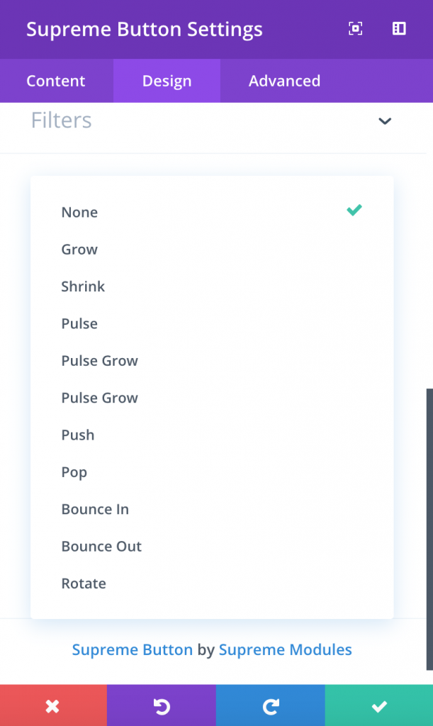
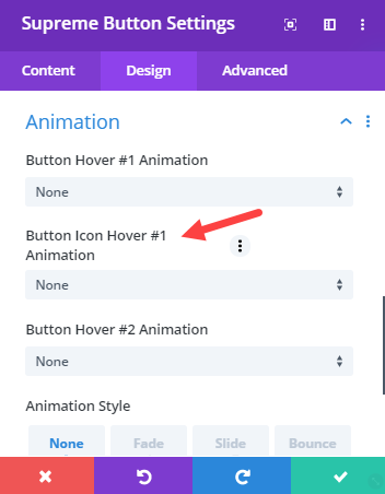
Button Hover #1 Animation
Here you can select one hover animation from the dropdown list for Button #1. You can select any from over 29 Animations. The Lite version of Divi Supreme will have only few of them.
Button Hover #2 Animation
Here you can select one hover animation from the dropdown list for Button #2. You can select any from over 29 Animations. The Lite version of Divi Supreme will have only few of them.
Button Icon Hover #1 Animation
If you've added Icon to the Button #1 and disable the switch called "Only Show Icon on Hover for Button One" then you'll see this Option in the Animation Panel, So you can add a Hover animation to Button's Icon as well from Over 15 Animations.
Button Icon Hover #2 Animation
If you've added Icon to the Button #2 and disable the switch called "Only Show Icon on Hover for Button Two" then you'll see this Option in the Animation Panel, So you can add a Hover animation to Button's Icon as well from Over 15 Animations.
Advanced Options
Use the advanced options to give your text module custom CSS ID’s and Classes. Add some custom CSS for advanced styling and designate the module’s visibility on certain devices.