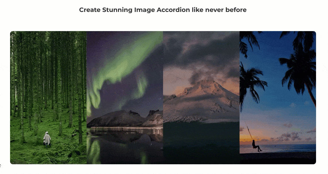
Divi Image Accordion Module
Let's you display all of your images on your Divi website with a stunning hover/click animation and effects. Add as many items as you need providing them with icons, images, titles, descriptions, buttons, and links easily and quickly. It ensures the perfect image quality and combines them beautifully with amazing accordion effects.
Content Options
Click on + Add new Item to add your first Image Accordion Item. Clicking + Add new Item will open a completely new list of design settings (including Content, Design, Advanced) for your new Image Accordion.
See below for individual Image Accordion Item settings.
After you add your first Accordion Item, you will see a gray bar appear with the title of your Image Hotspot shown as a label. The gray bar also has three buttons that allow you to edit, duplicate, or delete the Image Accordion in the Main Content tab.
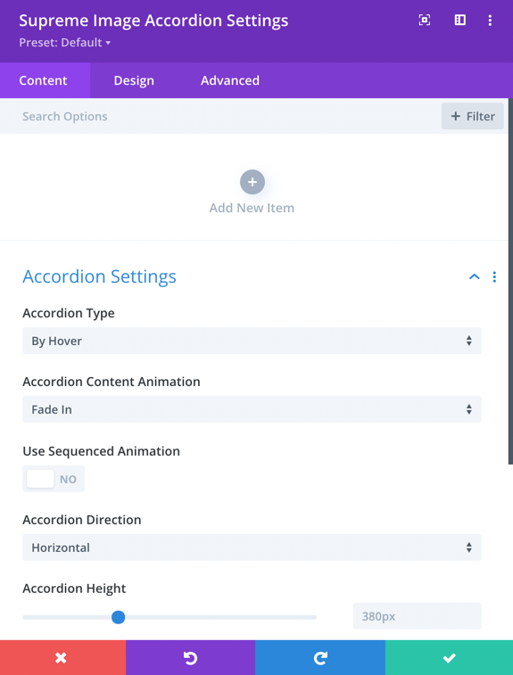
Accordion Settings
Accordion Type
Here you can choose whether to open the Image Accordion by Hover or Click.
Accordion Content Animation
Choose any animation from 5 different animations for Content entrance.
Use Sequenced Animation
Enabling this option will add animation separately to all Elements in the Accordion such as Title, Description, Button, Icon etc.
Accordion Direction
You can change the accordion direction to either Horizontal or Vertical.
Accordion Height
Change Accordion height from here.
Design Options
Overlay
Overlay Color
You can add Accordion to each Accordion from here, just change the color to any RGBA Value and it will be applied over your Image. This could be helpful to read your text clearly.
Icon
Icon Color
Change Icon color from her, If you've added in the Accordion.
Use Icon Font Size
Enable this option If you want to change the size of the Icon, you'll then see a handle to control the size of the Icon.
Icon Image
If you've replaced your Icon with an Image then you can manage It's styling from here, you can add Border, Corner radius and Box Shadow.
Title
Title Heading Level
Change the Heading level of the Title from H1 to H6.
And else you can play around with other settings to style the Title text.
Description
Here you can play around with the styling of the Description text the same way you style the paragraph in Default Text Module.
Button
This is where you can style the Button If you've added in Accordion. Enable the switch "Use Custom Styles for Button" and then you'll see options to style the button the same way you design Default Divi Buttons.
Advanced Options
Use the advanced options to give your Image Accordion module custom CSS ID’s and Classes. Add some custom CSS for advanced styling and designate the module's visibility on certain devices.
Image Accordion Item Content Options
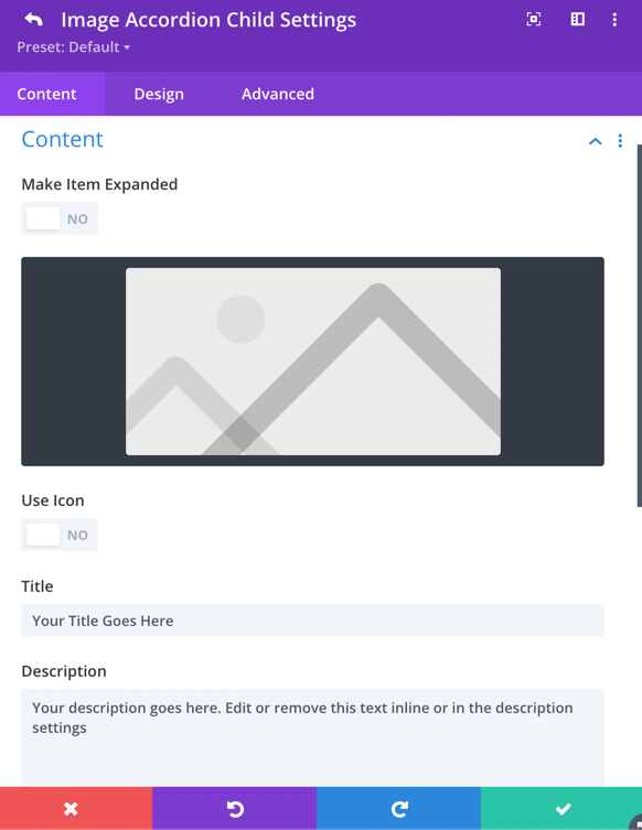
Make Item Expanded
As the name suggests, enable this option If you want the Item to be expanded by default.
Image
Add the Main Image for the Accordion here.
Use Icon
Enable this option If you want to add an Icon to the Accordion Content, then disable the switch If you want to use Image instead of icon.
Title
Your Main Title goes here.
Description
Your Description content goes here.
Show Button
Enable this switch If you want to use Button in your Accordion, then It will ask you for the Button Text & URL.
Horizontal Align
Here you can align the Accordion Content Horizontally to Left, Right & Center.
Vertical Align
Here you can align the Accordion Content Vertically to To, Bottom & Center.
Image Accordion Item Design Option
Overlay
Overlay Color
You can add Accordion to each Accordion from here, just change the color to any RGBA Value and it will be applied over your Image. This could be helpful to read your text clearly. Enable Hover option to add a Hover Overlay effect ~ Best for Item settings.
Title
Title Heading Level
Change the Heading level of the Title from H1 to H6.
And else you can play around with other settings to style the Title text.
Description
Here you can play around with the styling of the Description text the same way you style the paragraph in Default Text Module.
Button
This is where you can style the Button If you've added in Accordion. Enable the switch "Use Custom Styles for Button" and then you'll see options to style the button the same way you design Default Divi Buttons.
Sizing
Content Width
Change the Content width from here.
Image Accordion Item Advanced Options
Use the advanced options to give your Image Accordion Item module custom CSS ID’s and Classes. Add some custom CSS for advanced styling and designate the module's visibility on certain devices.