Divi Contact Form 7 Module
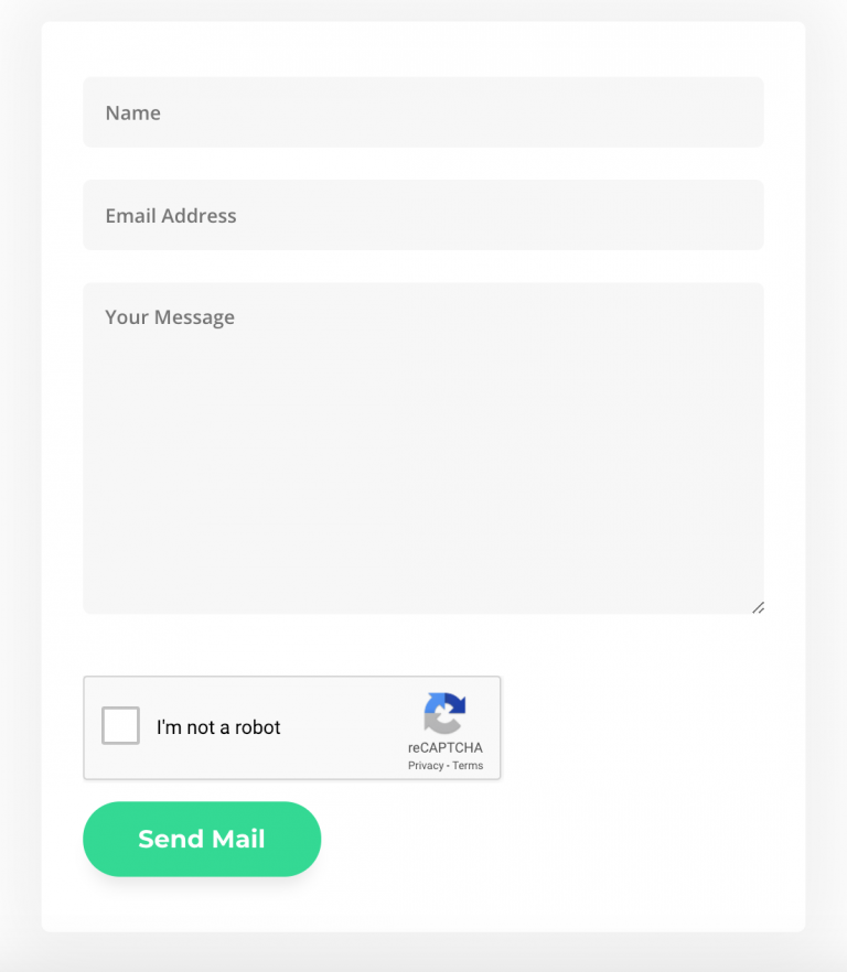
Big fan of Contact Form 7 plugin? Now with Supreme Contact Form 7, you can select your contact Form from the dropdown list without having to go back and forth switching between Visual Builder and Contact Form 7 setting page copying the shortcode and adding to the Divi Code Module. Style your Input Fields, Button, Labels, Validation, Error Messages and more!
Content Options
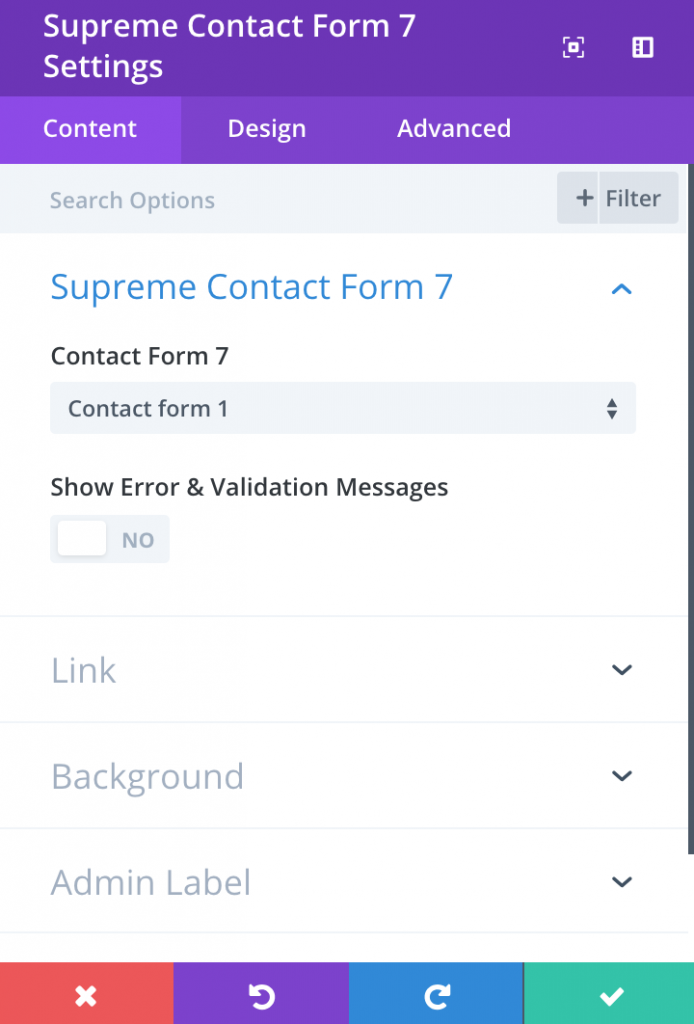
Contact Form 7
Select a contact form that should be used in the module. You can create new contact form 7 using the Contact > Add New page in your WordPress Dashboard. Each time you create a new contact form, the form will be selectable in this dropdown menu.
Show Error & Validation Messages
This will show the error and validation messages on the Visual Builder for styling purposes.
Admin Label
This will change the label of the module in the builder for easy identification. When using WireFrame view in the Visual Builder, these labels will appear within the module block in the Divi Builder interface.
Design Options
Within the design tab you will find all of the module’s styling options, such as fonts, colors, sizing and spacing. This is the tab you will use to change how your module looks. Every Divi module has a long list of design settings that you can use to change just about anything.
Labels
This is where you can style your label tag.
Bottom Spacing
The bottom spacing of the label.
Input, Textarea & Select
This is where you can style the Input, Textarea & Select such as background color, fonts, field rounded corners, border and more!
Placeholder
If you are using a placeholder on your Contact Form, this is where you can style the placeholder such as fonts.
Radio & Checkbox
If you are using a Radio & Checkbox on your Contact Form, this is where you can style the Radio & Checkbox such as fonts.
File
If you are using a File on your Contact Form, this is where you can style the File such as fonts, padding and background color.
Padding
Padding is the space added inside of your file wrapper, between the edge of the file and its internal elements. You can add custom padding values to any of the file wrapper’s four sides. To remove custom margin, delete the added value from the input field. By default these values are measured in pixels, but you can input custom units of measurement into the input fields.
Background Color
Here you can choose a background color for your file.
Error Messages
Here you can style the appearance of your Error Message. Make sure you turn on "Show Error & Validation Messages" in the Content Tab in order to view them in Visual Builder.
Background Color
Here you can choose a background color for your Error Messages.
Validation Error Messages
Here you can style the appearance of your Validation Error Messages. Make sure you turn on Show Error & Validation Messages in the Content Tab in order to view them in Visual Builder.
Background Color
Here you can choose a background color for your Validation Error Messages.
Validation Success Messages
Here you can style the appearance of your Validation Success Messages. Make sure you turn on Show Error & Validation Messages in the Content Tab in order to view them in Visual Builder.
Advanced Options
Use the advanced options to give your text module custom CSS ID’s and Classes. Add some custom CSS for advanced styling and designate the module’s visiblity on certain devices.