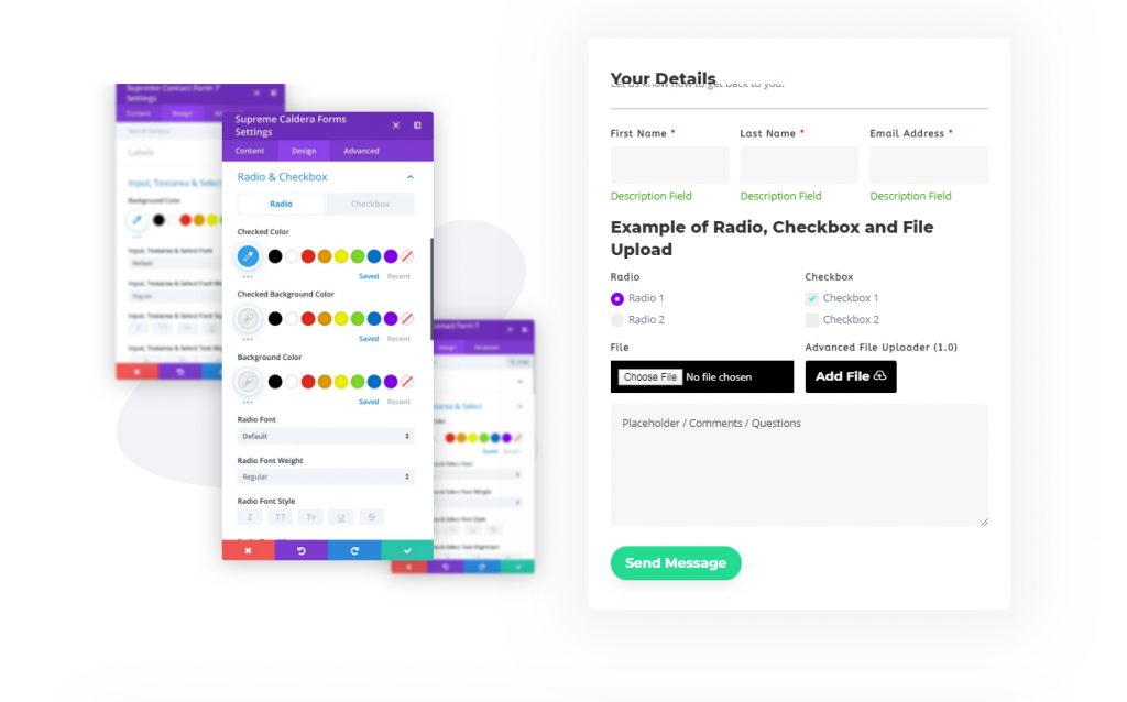
Divi Caldera Forms Module
Now with Divi Supreme Caldera Forms module, you can select your contact form from the dropdown list without having to go back and forth switching between Visual Builder and Caldera Forms setting page to copy the shortcode and adding it to the Divi Code Module. Style your Title, Body, Horizontal Ruler (HR Tag), Labels, Field Description, Input, Textarea, Select, Placeholder, Radio, Checkbox, Basic File, Error Messages, Success Message, Submit Button, Advanced File Button and more coming your way.
Content Options
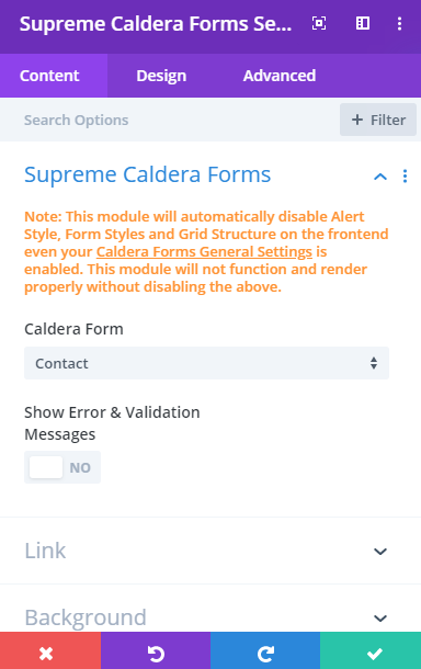
That "Note" at the top means that you'll need to disable the Default Caldera Forms styling by going to Caldera Forms and click "General Settings" at the Top and disable all the switches from here.
Caldera Forms
Caldera Form
Select a form from the dropdown all of your forms that you’ve created using the Caldera form plugin will appear in the Dropdown menu. If you haven’t created a form already Hover over to Caldera Form > Forms and click on the New Form button at the top.
Show Error & Validation Messages
This will show the error and validation messages on the Visual Builder for styling purposes.
Admin Label
This will change the label of the module in the builder for easy identification. When using the WireFrame view in the Visual Builder, these labels will appear within the module block in the Divi Builder interface.
Design Options
Header Text
Here you can play around with the header text you may have added to the Form while creating the Form.
Body Text
Here you can play around with the body/description text you may have added to the Form while creating the Form.
Horizontal Ruler (HR Tag)
Color
Here you can change the color of the Divider line in the Form.
Gap
You can add spacing to the top and bottom of the Divider line in the form.
Label
Bottom Spacing
Add some spacing to the bottom of the Label.
Required Asterisk Color
Change the color of the (*) with the showing with the label which indicates that this field is Important to be filed.
And else you can change the color, size, font and more of the Label text.
Field Description
If you’ve added a description to the field(Shows down of the field) then you can style it here. You change the background color and size, font, weight and more of the description text.
Input, Textarea and Select
All the changes you’ll make here will be applied to all the form fields including Name, Email, Message box and to the Drodpwn select field as well.
Margin Bottom
Add some spacing at the bottom of all the fields.
Background Color
Change the Background color of the form Fields and Select box.
You can change the input Font, Size, color and more of the text will be entered in the Field.
Field Rounded Corners, Border and Box Shadow
Here you can control the corner radius of the Form Field. Enable the link icon to control all four corners at once, or disable to define custom values for each. You can play around with adding borders and Box Shadow to the Form Field.
Input, Textarea and Select Focus
When you’ll try to write something in the form and wanted to add some attention to the field then use this option to change the size, weight, and more of the text Input.
Placeholder
If you are using a placeholder on your Contact Form, this is where you can style the placeholder such as font, size and more.
Radio & Checkbox
If you are using a Radio & Checkbox on your Contact Form, this is where you can style the Radio & Checkbox such as font, size and more.
- Custom Radio/Checkbox Styles
- You can switch this option to add custom styles to the Radio/Checkbox.
- Checked Color
- You can change the color of the circle icon when checked here.
- Checked Background Color
- You can change the color of the background when checked here.
- Background Color
- You can change the color of the background for the Radio/Checkbox here.
Basic File
If you’ve added a Basic file uploader to the form then it can style here. You can add Padding, Change the background color, font, size, weight and more.
Error Messages
Here you can change the error message background color, font, size and more. You can also add drop shadow, Rounded corners and Borders to the Error message.
Success Messages
Here you can change the Success message background color, font, size and more. You can also add drop shadow, Rounded corners and Borders to the Success message.
Submit Button
Button Alignment
Change the alignment of the button to Left, Center or Right.
Margin Top
Add some top margin to the button here.
Use Custom styles for the button
You can switch this option to style the Submit button the same way you style the Divi Button or any button in Divi Builder.
Advanced File Button(1.0)
Use Custom styles for the Advanced File Button(1.0) You can switch this option to style the Advanced File Button(1.0) the same way you style the Divi Button or any button in Divi Builder.
Advanced Options
Use the advanced options to give your Caldera Forms module custom CSS ID’s and Classes. Add some custom CSS for advanced styling and designate the module’s visibility on certain devices.