Divi Blog Carousel Module
Surprise your Visitors by showing your Posts in a new & creative way using Divi Supreme Blog Carousel Module. Add some special post Carousels to your site and take Blogging with Divi to the next level.

Content Options
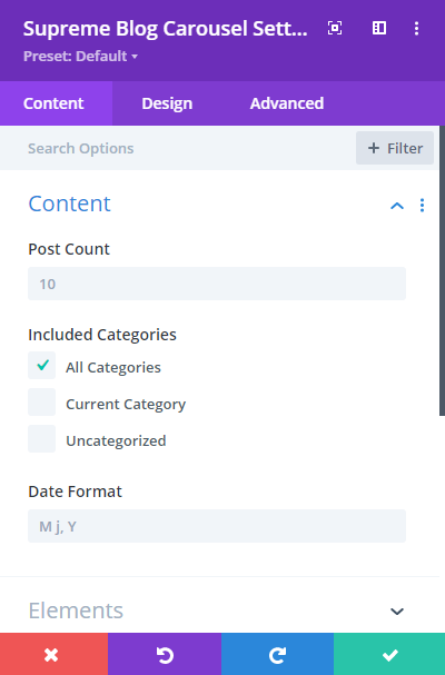
Post Count
Enter how many posts you want to show in the Carousel here.
Included Categories
Choose Which post categories you want to show, you can select a particular category or choosee "All Category" to show all category posts.
Date Format
Change the Date format from here the way you like.
Elements
Show Featured Image
Enable or Disable this switch to show or hide Post's Featured Images.
Show Title
You can choose whether to display the Post Title or not, Disable it to hide the Post Title.
Show Excerpt
Enable to Disable this switch to show or hide the Post Excerpt.
Excerpt Text
Change the length of the Excerpt text here, enter value in numbers.
Show Date
You can choose whether to display the Post Publish Date or not, Disable it to hide the Date.
Show Category
Enable this switch If you want to show Post Categories in the Carousel for each post.
Meta Separator
Here you add a custom Meta Separator.
Author
You can choose whether to display the Post Author or not, Disable it to hide the Author Info from the Carousel.
Readmore Button
Enable this switch If you want to show the Readmore button for each Post card in the Carousel.
-Readmore Text
Add a custom Text for Readmore button here.
-Read More Link Target
From here you'll be able to change the Link Target to open in the Same Tab or in a New Window.
Show Bottom Meta Elements
This is something really cool, you can enable this option to show a nice looking Author Image and Name and Post Publish date for each Post card.
-Bottom Date
You can disable this switch If you don't want to show Date in this Meta Element.
-Bottom Author
You can also hide post Author Name by disabling this switch.
Carousel Effect
Choose a Carousel effect from 4 Different Effects and more to add soon.
- Slide
- Coverflow
- Flip
- Cube
Carousel Direction
You can change the Carousel Content Direction from here, It can be either "Left to Right" or "Right to Left".
Columns
Enter how many columns you want to show in the Carousel.
Use Multiple Row
You can enable this option If you want to show multiple rows of Posts, lets say you enter 2 in the "Row Per Slide" field and then you'll see two Rows of Posts, a new one below the first one and It will work the same way. You can change the "Row Per Slide" value to whatever you like.
Centered Mode
If enabled, then active slide will be centered, not always on the left side.
Spacing
Add some spacing between carousel Items.
Transition Duration
Change the duration when sliding the Carousel using the arrows here.
Infinite Looping
Enabling this option causes the carousel to loop. Means when you’ll click on the arrow to go to next slide it will then keep looping and shows all the item from first to end. Disabling this will show only the number of Posts and you can’t use the next arrow if slides are ended then you’ll have to use the previous arrow.
Autoplay
You can enable this option to slide Carousel Items automatically according to the time you'll set.
-Autoplay Speed
Change the time interval for the slides to change after that time.
-Pause on Hover
Enable this option, If you want to pause the carousel autoplay when the mouse is on the Carousel Module.
Pagination
Enable or Disable this option to show or hide the pagination dots.
Navigation
Enable or Disable this option to show or hide the arrows.
Use Equal Height
Equalize the carousel Items height. Carousel Card Items will be 100% in Height.
Design Options
Post Item
Changes you'll make here will be applied to the Post Items/Cards in the carousel.
Post Item Padding
Add padding around the Post Item here.
Background Color
Add a background color for each post Card in the Carousel here.
And else you can play around with adding Corner Radius, Border and Box Shadow to Post Items/Cards in the Carousel.
Post Thumbnail
Thumbnail Height
You can change the height of the Featured Image here. A really helpful option.
And else you can play around with adding Corner Radius, Border, Box Shadow and Filters to Post Thumbnails in the Carousel.
Post Entry Title
Here you can change the Title styling, you can change the Heading Level, font, size, weight and much more for the Title.
Post Entry Summary
Here you can style the Description/Excerpt text the way you like.
Post Entry Meta
This is where you'll be able to style the Meta text, such as Date, Category, and Author font.
Alignment
Here you can change the alignment of the Meta text to Left, Right or Center.
And below you'll find options to style you Author, Date and Category Text's Font, Weight, Color and much more. You can give different styling to all of them.
Readmore
This is where you can style the Readmore button. Enable the switch "Use Custom Styles for Readmore" and then you'll see options to style the Readmore button the same way you design Default Divi Buttons.
Align Button Vertically
Enable this option, If you'd like to vertically align the button. This option will be shown If you've enabled the "Equal Height" option in the Carousel Settings Panel. You can align the button to Top, Center or Bottom from here.
Navigation
This is where you can style the Navigation/Arrows of the Carousel.
Navi Vertical Position
You can change the vertical position of the Arrows/Navigation here.
Left Navigation Position
From here you can horizontally change the position of the Left/Prev Arrow.
Right Navigation Position
From here you can horizontally change the position of the Right/Next Arrow.
Navi Arrow Icon Size
Here you can change the Size of the arrows.
Custom Prev Arrow Icon
Enable this option If you want to set a custom Icon for the Prev Arrow, enabling this option will show the Divi Icon Library to choose an icon.
Custom Next Arrow Icon
Same goes here, enable this option If you want to set a custom Icon for the Next Arrow, enabling this option will show the Divi Icon Library to choose an icon.
Arrow Color
Here you can change the Arrow Color.
Arrow Background Color
Change the Arrow Background color from here.
And below you'll find options to add Rounded Corners, Border and Box Shadow to the Arrow Icons.
Pagination
This is where you can style the Pagination/Dots.
Pagination Position
Change Vertical position of the Pagination here.
Pagination Color
Change the color of the Pagination here.
Pagination Active Color
Change the Active Pagination color from here.
Pagination Button Style
Here you can change the Pagination style, you've got 3 different styles to choose from.
- Default
- Dynamic
- Progress Bar
Bottom Meta Items
Here you can play around with Bottom Meta Items styling.
Image Width
Change the Author Image width from here.
And else you can play around with the Author Name and Date Text styling. And add Rounded Corners, Border and Box Shadow to the Author Image.
Overlay
Enable this switch If you want to show an Overlay when hover on Thumbnail. When you'll enable this option It will open some settings and ask you to pick an Icon from Divi Icon Library.
Overlay Icon Color
Change the Icon Color here.
Overlay Icon Size
Change the Size of the Icon from here.
Overlay Background Color
Change the Overlay Background Color here.
Advanced Options
Use the advanced options to give your Blog Carousel module custom CSS ID’s and Classes. Add some custom CSS for advanced styling and designate the module’s visiblity on certain devices.