Divi Responsive Viewer Extension
Introducing Responsive Viewer Extension for Divi. Want to create even more responsive websites with Divi then this extension is made for you.
Breakpoint Presets Preview
Save your precious time and preview all your responsive design in different breakpoint with just a few clicks.
Custom Breakpoint Preview
Besides choosing from the presents, You can also set your own custom responsive sizes right in the Divi Builder.
Perfect Responsive
It’s time to make your mobile Divi sites even better. Preview your beautiful design for iPhone, iPad, Android devices or even the biggest or smallest mobile devices.
 ## Before you start using
Make sure that the extension is enabled from Divi Supreme’s Settings page for it to work.
 ## How it Works?
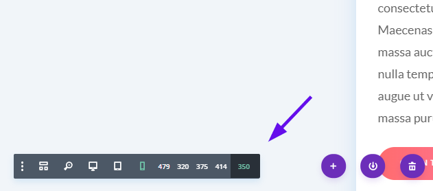
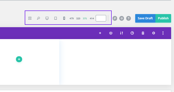
After enabling the extension you’ll now be able to see more responsive sizes when you’re editing your page using Visual Builder, Backend Divi Builder, and Theme Builder. When you’ll go to Mobile view you’ll now see some more screen sizes and a field where you can set your own custom size.
 The size of the Mobile view by default in Divi was 479px but using this extension you can change them to 375px, 320px or even small or large, Helping you to create even more Responsive sites with Divi. If you want to add a custom value like 350px just put it in the Field and Press Enter. Make sure you only put the value not px.
 So there you go that’s how easy it is to use this extension, Saving your time to go to the Browser Inspect tool every time you’re creating your page. We hope that you’ll found it useful for your next project.
Backend Builder Preview
Here’s a quick look at how it Looks like in the Backend Divi Builder. If you love to use the Divi Backend builder that don’t worry this extension also work perfectly there.

Theme Builder Preview
This extension also works with the Divi’s Theme Builder helping you to create more responsive Header, Footer, Archive pages and more. Here’s a quick look

