Divi Content Timeline Module
Divi Supreme Content Timeline Module allows you to create beautiful and compelling timelines using your content. With its easy-to-use interface, you can create a timeline in minutes, without any coding required. Plus, the module is fully responsive, so it looks great on any device.
Content Options
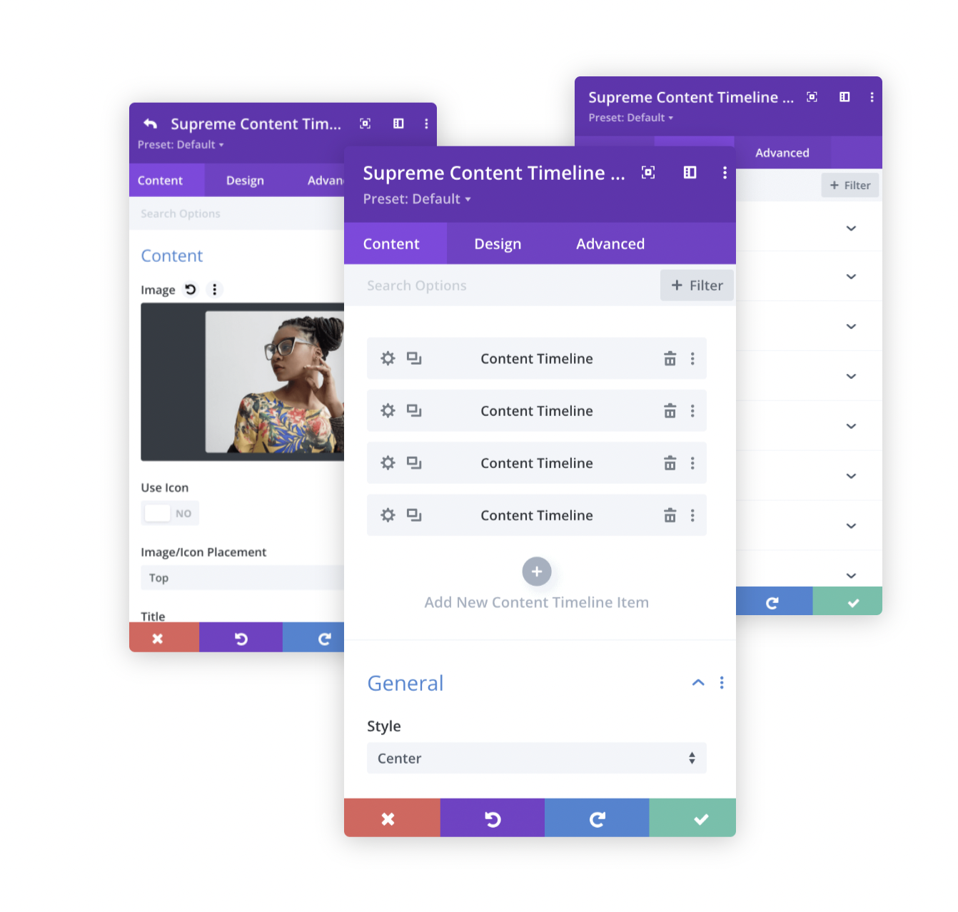
Adding Timeline Items
Click on + Add new Item to add your first Timeline Item. Clicking + Add new Item will open a completely new list of design settings (including Content, Design, Advanced) for your new Timeline.
See below for individual Timeline Item settings.
After you add your first Timeline, you will see a gray bar appear with the title of your Timeline shown as a label. The gray bar also has three buttons that allow you to edit, duplicate, or delete the Timeline.
General
Style
Choose a style for your Timeline here. You can select Left, Right, or Center.
Mobile/Tablet Style
Here you can choose Style for Mobile/Tablet only. You can select either Left or Right.
Show Card Arrow
Enable this option If you'd like to show Card Arrow pointing to the Pointer Element in the Timeline.
Enable Tree Animation
If you want to show Scroll Animation on Tree, enable this option. You'll be able to customize the colors from the Design tab.
Design Options
Alignment
Here you'll be able to change Content Alignment.
Title Text
This is where you can customize the Title Text by changing its font, size, color and weight and even add shadow to the Title.
Content
This is where you can customize the Content Description by changing its font, size, color and weight etc.
Opposite Text
This is where you'll be able to customize the Opposite Text, If you've added. Opposite text shows Opposite side of the Content Timeline for each item.
Background Color
Change the Background color of the Opposite Text here.
Width
You can adjust the width of the Opposite Text here.
Padding
If you'd like to add Padding to the Opposite text, you can do so here.
Else you can customize the Opposite Text by changing its font, size, color and weight & even add Border, Border Radius & Box Shadow. However you like.
Card
This is where you'll be able to customize the Cards.
Background
You can change the Card Background from here. You can even change Card Background from each item Content Options. If you'd like to have a different color for each or If you decide to use Image for Card Background.
Margin
Here you'll be able to add Margin to the Card If needed.
Padding
Here you can add Padding to the Card If needed.
Else you can customize the Card by adding Border, Border Radius & Box Shadow etc.
Pointer
This is where you'll be able to customize the Pointer Element.
Background Color
Here you can change Background color of the Pointer - for Normal State.
Active Background Color
Here you can change Background color of the Pointer - for Active State. If Tree Animation Enabled.
Icon Color
Here you can change Icon color of the Pointer - for Normal State. If you've added Icon from Item Content Options.
Active Icon Color
Here you can change Icon color of the Pointer - for Active State. If you've added Icon from Item Content Options.
Icon Font Size
Here you can change the Icon Size If you wish to.
Else you can customize the Pointer by adding Border, Border Radius & Box Shadow etc.
Tree
Background
You can change the Tree Background/Line color from here.
Active Background
You can change the Tree Background/Line color from here for Active State. If Tree Animation is enabled.
Width
Here you can change the Tree Line Width If you wish to.
Image & Icon
This is where you'll be able to customize the Image & Icon of the Card.
Icon Color
Here you'll be able to change the Icon Color.
Icon BG Color
This is where you'll be able to change Icon Background color.
Icon Font Size
Here you can change Icon Font Size If you wish to.
Image Width
If you're using Image instead of Icon, you can change Image width from here.
Image/Icon Alignment
Here you'll be able to change Image or Icon Alignment.
Else you can customize the Image/Icon by adding Padding/Margin, Border, Border Radius & Box Shadow etc.
Button
Enable Use Custom Styles for the button to add custom styling to the button. You can design the button same way you always design your Divi Buttons you can change button, font, size, weight and more and play with Margin and Padding and also you can add Corner Radius, Border and Box Shadow to the button.
Animation
This part is important, If you'd like to add Entrance Animation to the Cards just as shown in the demo. You can do so here. We're using Divi's Animation Presets to add Animation to the Card the way you like. Just select any animation and adjust it the way you like.
Please Note, the animation will only work on Frontend and might not show correctly in Divi Builder.
Advanced Options
Use the advanced options to give your Content Timeline module custom CSS ID’s and Classes. Add some custom CSS for advanced styling and designate the module's visibility on certain devices.
Content Timline Item Content Options
Content
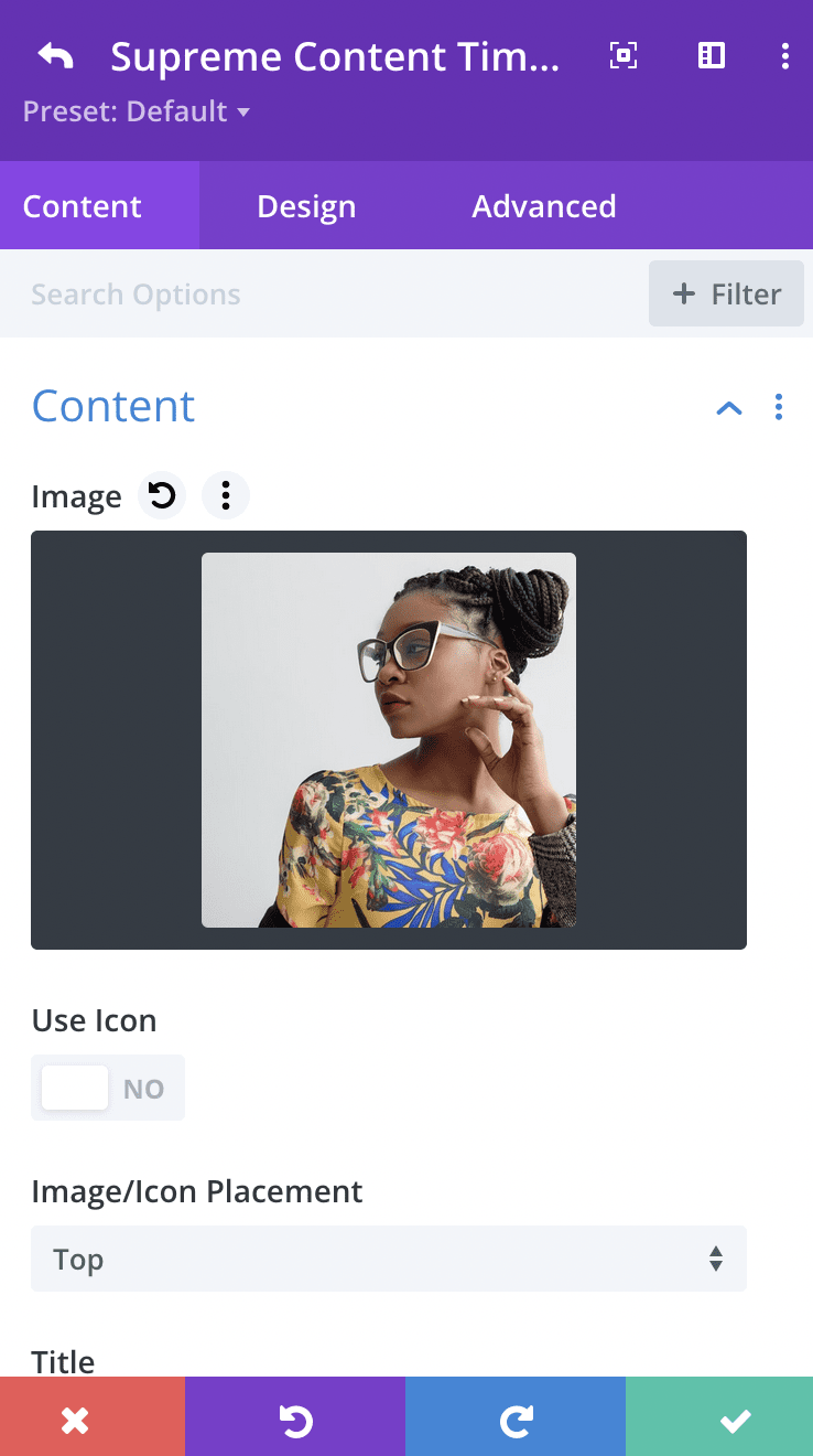
Use Image/Icon
Enable this option If you'd like to use Image/Icon. Once enabled, you'll see option to add your Image.
Use Icon
Enable this option If you'd like to use Icon Instead.
Image/Icon Placement
Here you can change the Image/Icon Placement to either Top of Content or on Left of the content.
Title
Add Your Title here.
Content
Here you'll be able to add your Content Description.
Use Pointer Image/Icon
Enable this option If you'd like to use Image or Icon in the Pointer. You'll then see a new Panel where you can add your Image or Icon.
Opposite Text
You can add your Opposite text here.
Pointer Image/Icon
You'll see this panel, If you enable "Use Pointer Image/Icon" from the Content Panel. Once enabled, you'll be able to add your Image to the Pointer or add Icon from Divi's Icon Library.
Button
Button text
Add text to the button here you can always remove the text of the element which you don’t want.
Button Link URL
Add a URL to the button here.
Button Link Target
Choose whether you'd like to open the URL in a new Tab or the Same Tab.
Timeline Item Design Options
Alignment
Here you'll be able to change Content Alignment.
Title Text
This is where you can customize the Title Text by changing its font, size, color and weight and even add shadow to the Title.
Content
This is where you can customize the Content Description by changing its font, size, color and weight etc.
Opposite Text
This is where you'll be able to customize the Opposite Text, If you've added. Opposite text shows Opposite side of the Content Timeline for each item.
Background Color
Change the Background color of the Opposite Text here.
Padding
If you'd like to add Padding to the Opposite text, you can do so here.
Else you can customize the Opposite Text by changing its font, size, color and weight & even add Border, Border Radius & Box Shadow. However you like.
Button
Enable Use Custom Styles for the button to add custom styling to the button. You can design the button same way you always design your Divi Buttons you can change button, font, size, weight and more and play with Margin and Padding and also you can add Corner Radius, Border and Box Shadow to the button.
Image & Icon
This is where you'll be able to customize the Image & Icon of this Item Card.
Image/Icon Width
You can change Image/Icon width from here.
Image/Icon Alignment
Here you'll be able to change Image or Icon Alignment.
Else you can customize the Image/Icon by adding Padding/Margin, Border, Border Radius & Box Shadow etc.
Card
Here you'll be able to customize this Item's Card. You can customize it by adding Padding/Margin, Border, Border Radius & Box Shadow etc.
Timeline Item Advanced Options
Use the advanced options to give your Content Timeline Item custom CSS ID’s and Classes. Add some custom CSS for advanced styling and designate the module’s visibility on certain devices.